Arbitrus.ai is an arbitration tool for settling disputes using AI technology. While the public court system and current online arbitration services are expensive and time consuming, Arbitrus.ai helps users settle disputes faster, cheaper and with greater procedural integrity.
THE PROBLEM
I was tasked with designing the interface for the AI-powered arbitrator. This product needs to pace the user’s tasks throughout the arbitration process, while also considering all aspects of the claim to determine a fair, informed decision for all parties involved.
THE GOAL
Generate a tool to accelerate and enhance the arbitration procecss. Keep the interface concise while remaining accessible.
ROLES
Mary Pyrdol - Sole UX/UI designer and researcher.
RESPONSIBILITIES
Competitive analysis, wireframing, prototyping,
unify branding, and advertising materials.
PROJECT DURATION
October 2024 - January 2025
On top of UI/UX design, I also enjoy creating animations to bring to life the important features of a product. Here's an animation I made in Adobe After Effects, describing the benefits and overall catalyzation of the arbitration process via Arbitrus.ai.
SUMMARY
In preparation for my design tasks with Arbitrus, I conducted a competitive audit on the American Arbitration Association (AAA) to study current automation of the arbitration process.
AAA provides resources for connecting with human arbitrators online, but nowhere do they have a tool where users can get straight to arbitration. Users are required to apply for an arbitration and wait for a response which could take anywhere from days to months. This revealed a lack of efficiency in current digitization of legal resources, providing an opportunity to improve the process.
I considered where AAA organized forms and contracts for users, as well as providing users with a list of tasks they must complete in their application form. I wanted to provide the users with enough instructions within each step without overwhelming them. Nesting these sub-lists of instructions into individual pages of the process was the best adaptation to utilize.
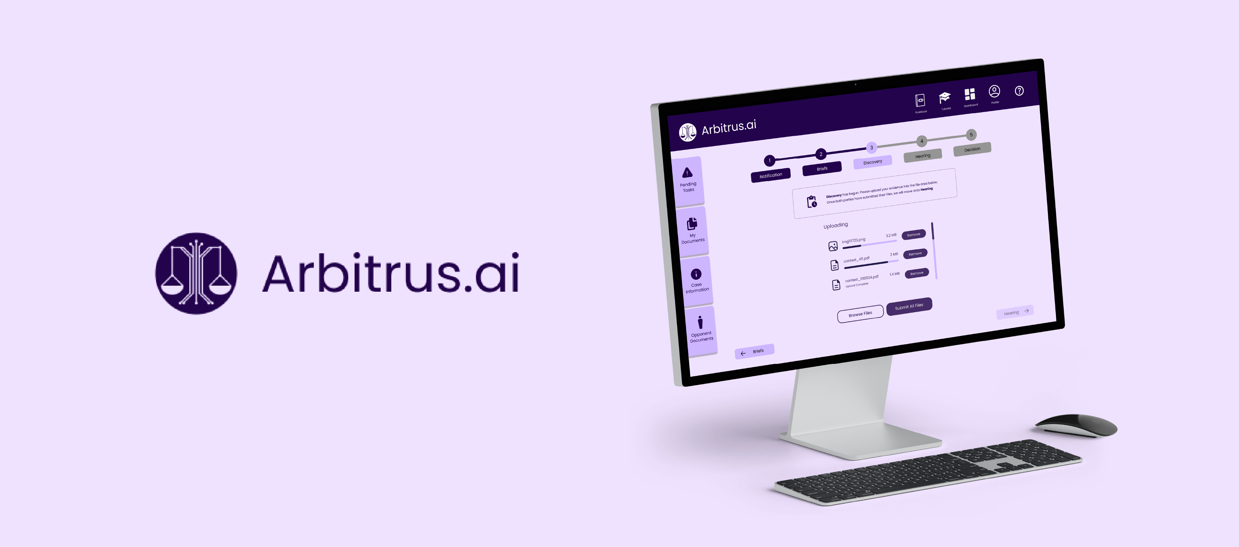
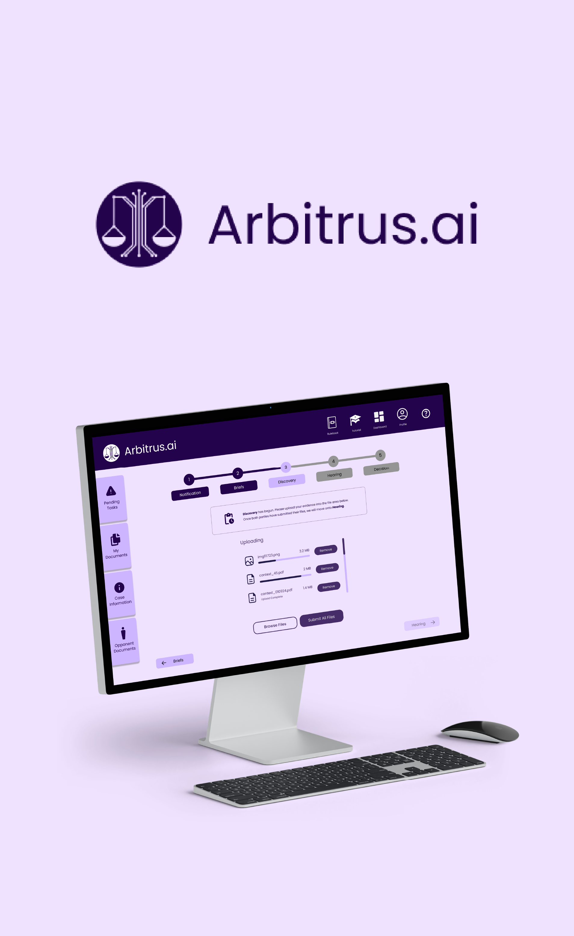
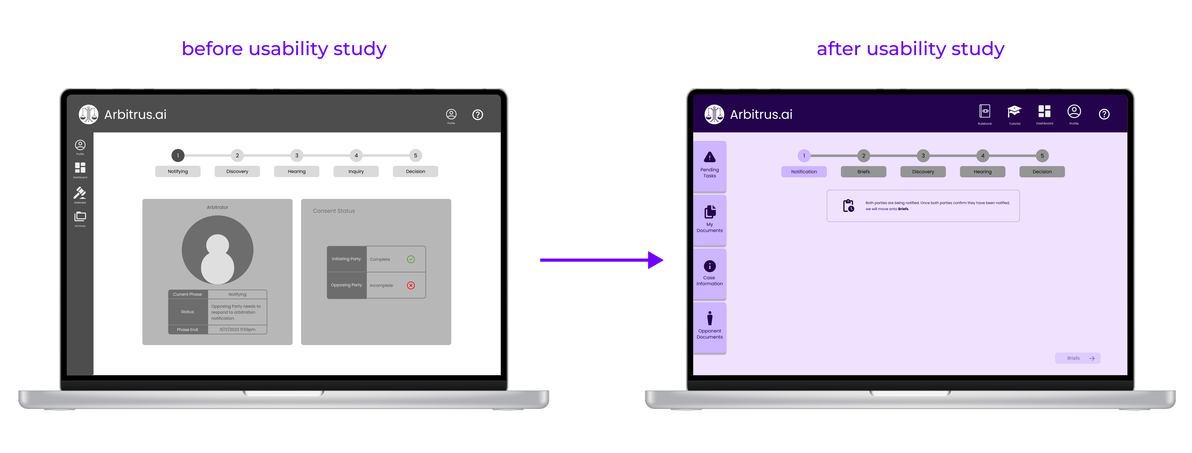
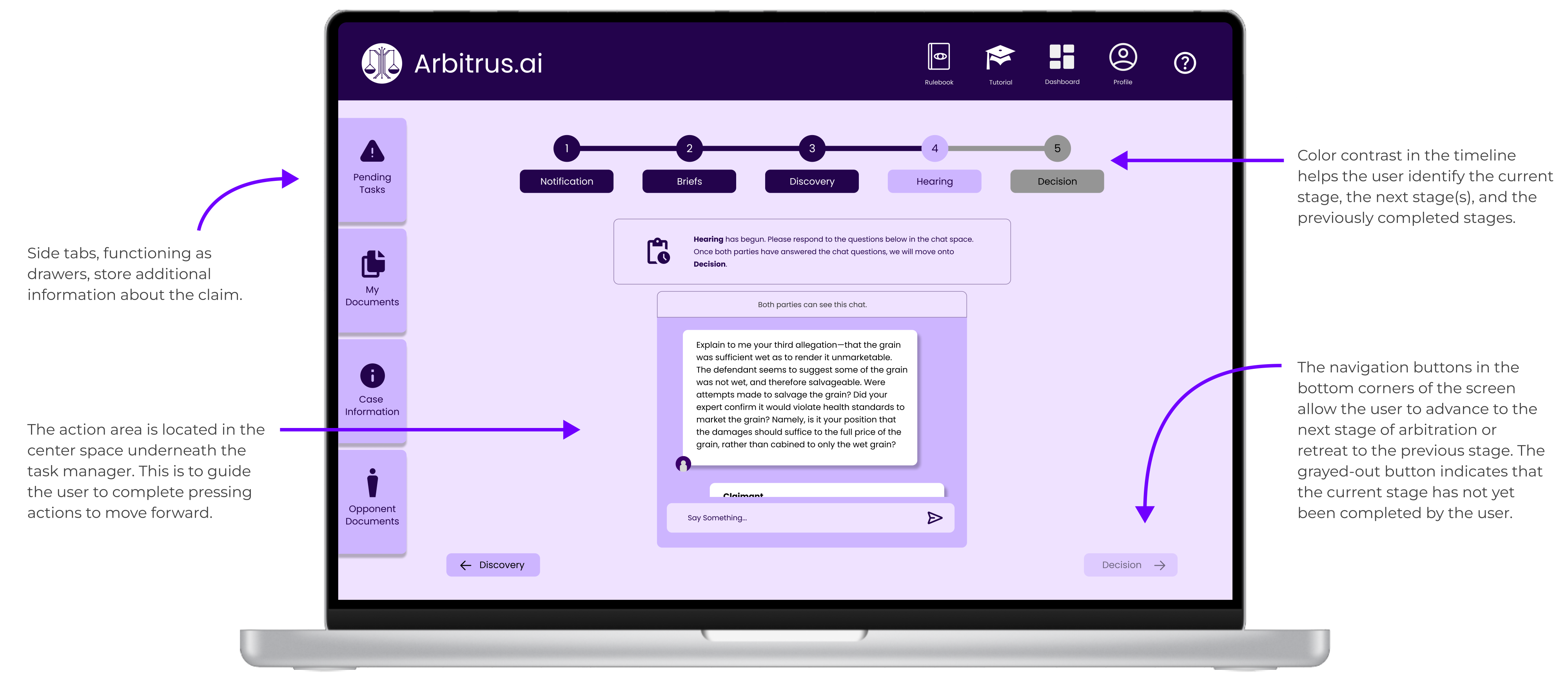
Provide users with clear context about their current stage in the arbitration process, outline the steps that come next, and communicate the timelines for completing any required actions.
Front and center, this notification section will populate with instructions for the user and when they are to be completed.
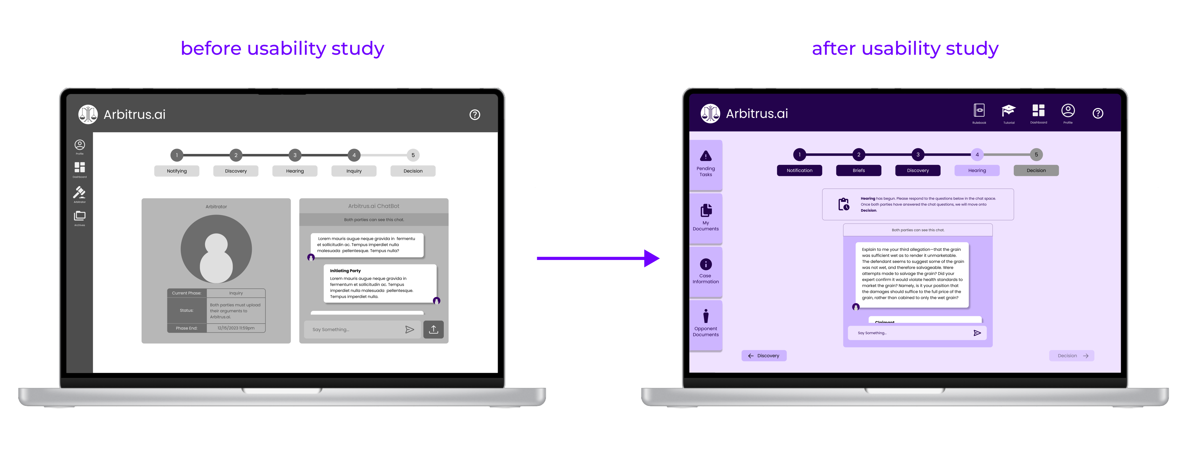
At the Hearing stage of arbitration, the AI model will take place, asking the users specific questions about their case to consider for the decision of the dispute.
For mapping out the user flow, I reviewed the steps of the arbitration process with our CEO (a law professional) to then configure the entry and exit points as it followed the steps of a standard US arbitration process.
User Flow Map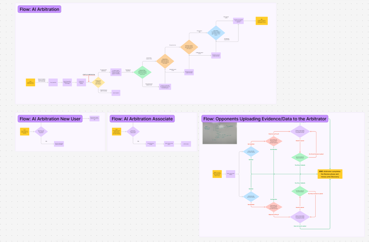
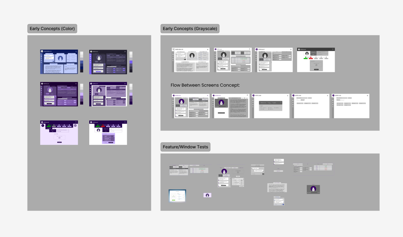
There were many features and functions I wanted to include on the initial screen design of Arbitrus. I tested the idea of distinguishing the different actions into their own windows, but the screen quickly became crowded. I then transformed the mini windows into tabs, trying to better manage the screen space.
Early Concept DesignsThe biggest issue addressed in our lo-fis was utilizing screen space more efficiently. Different from our early concepts, I organized the steps of the arbitration process onto different screens.
Low-Fidelity Prototype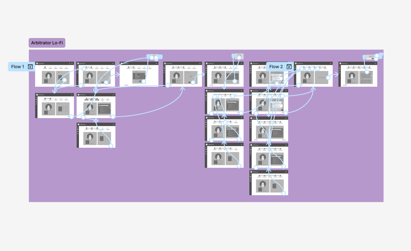
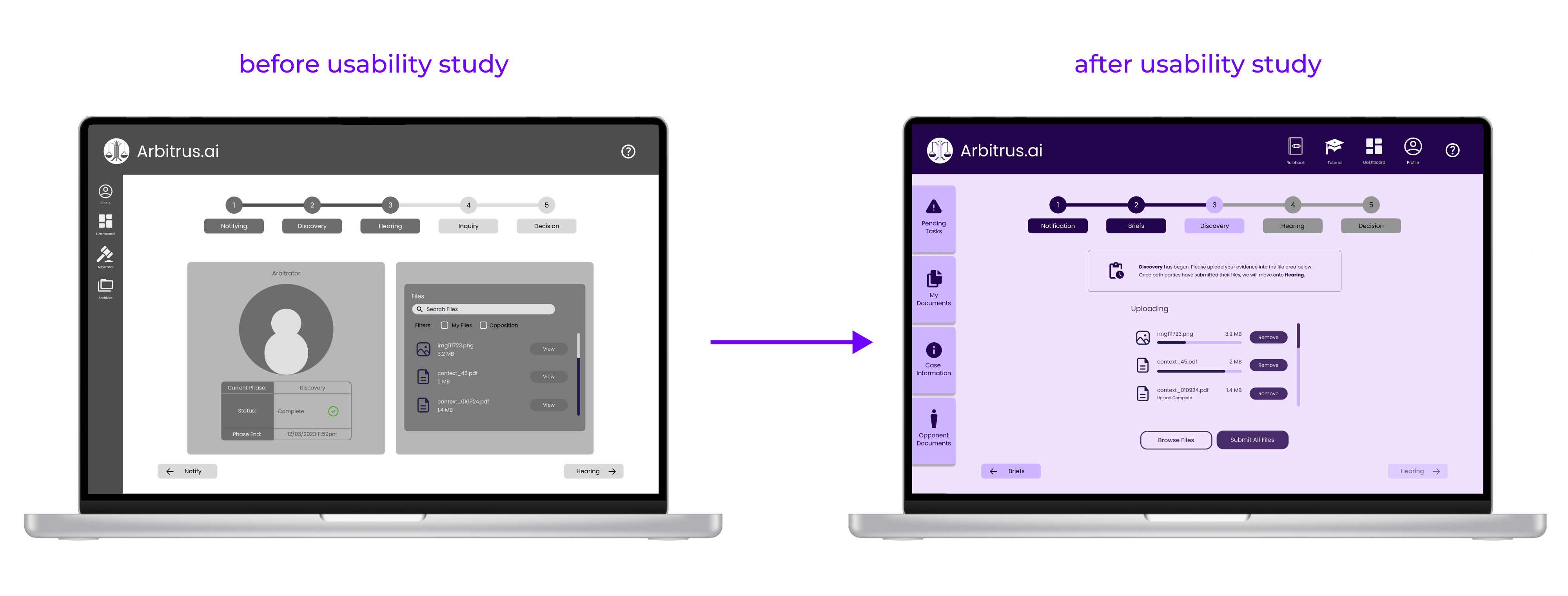
I was then able to organize the different tasks to their respective stages (i.e., uploading evidence on the “Discovery” page, inputting responses on the “Hearing” page). This saved a lot of screen space in the hi-fi prototype. I solidified this structure with the use of a timeline/breadcrumbs feature at the top center of the screen.
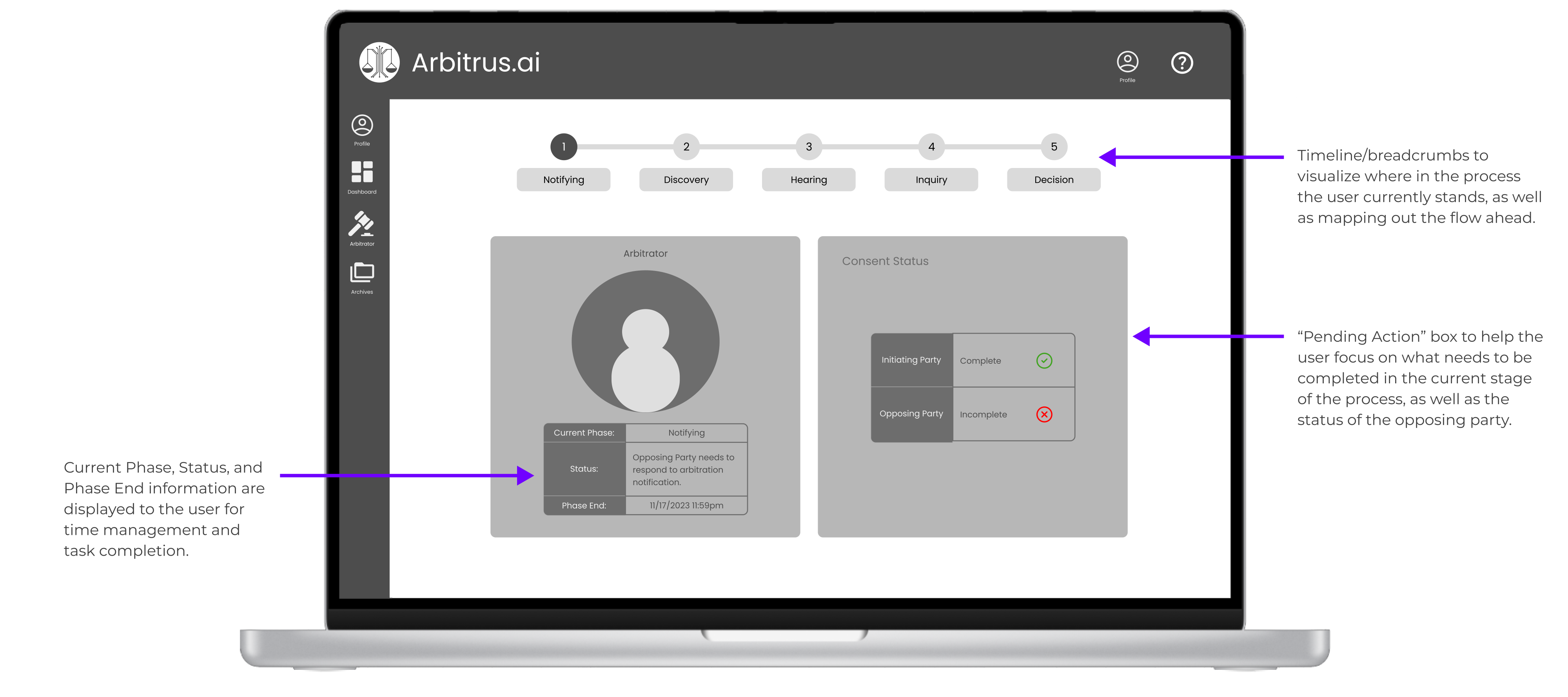
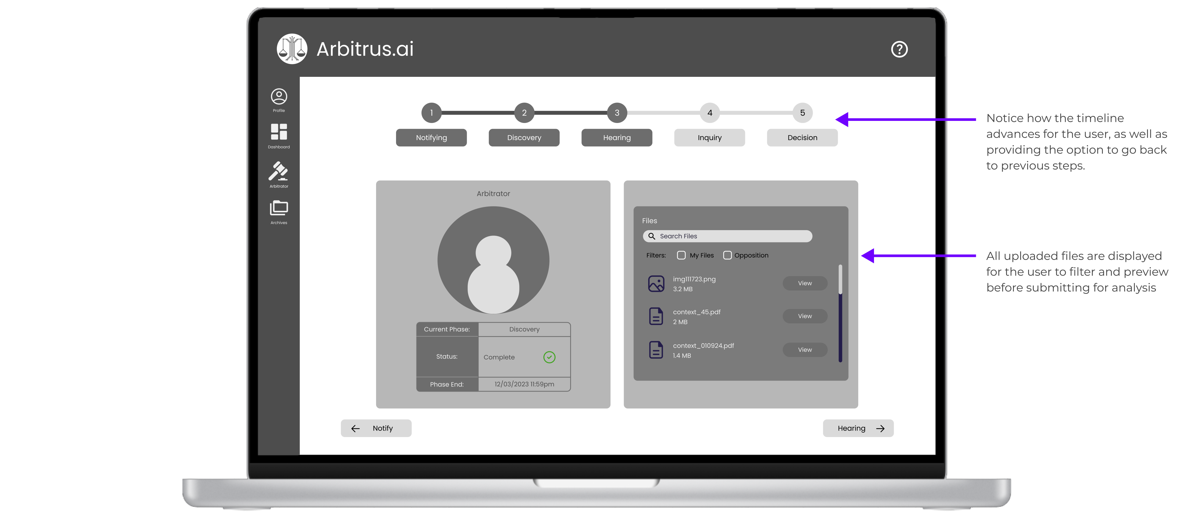
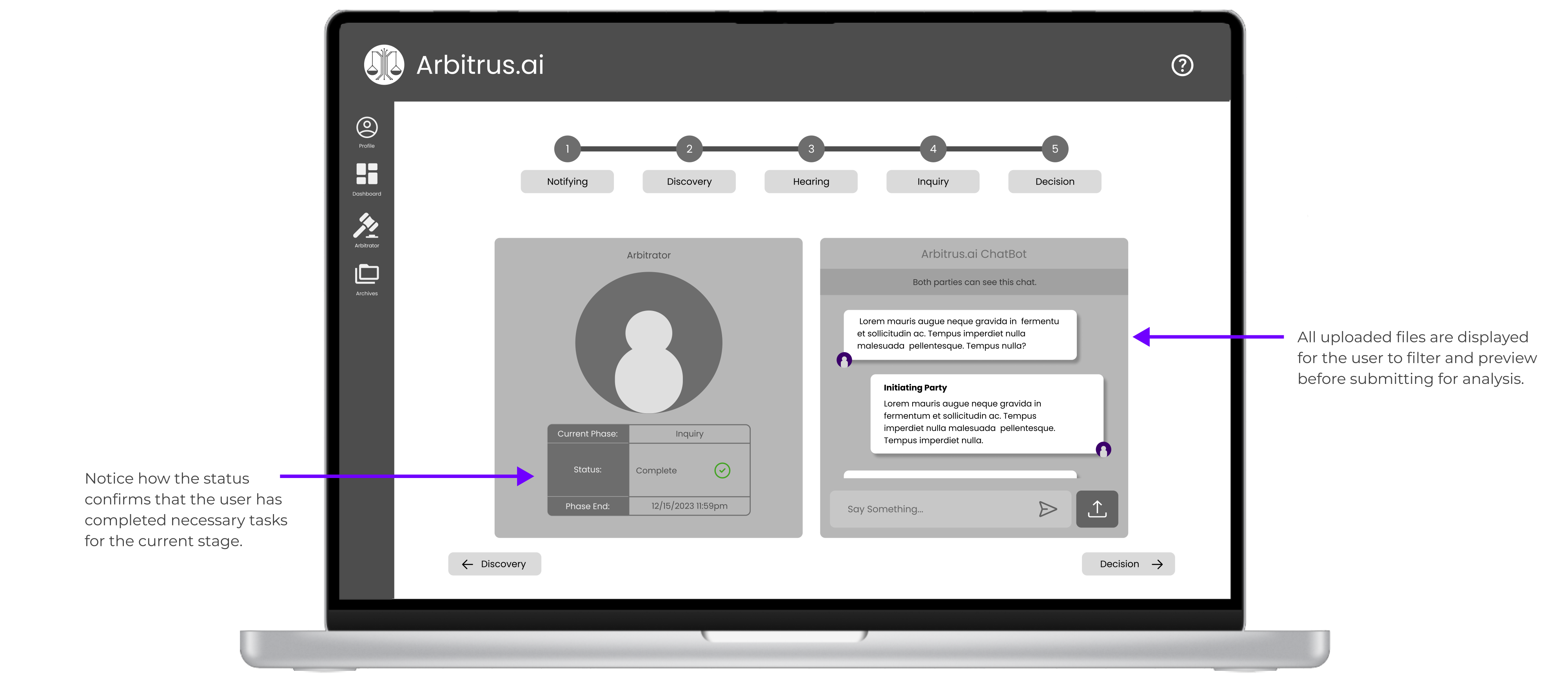
After some moderated usability testing for pain points, I simplified the display by creating a smaller, more central task manager. I also removed the large AI profile icon because it became less necessary as we tested the flow of the arbitrator, and took up significant screen space.
High-Fidelity Prototype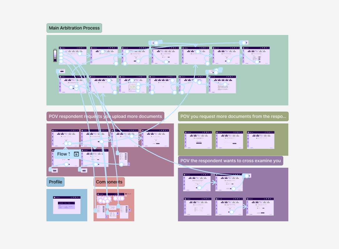
Additionally, one of the most useful updates was the use of tabs on the left-hand side of the screen. The tabs function as drawers and slide out to the right to reveal their contents, creating more breathing room and organizing all the necessary arbitration information for the user.
The main improvement in the hi-fi designs was avoiding cognitive overload. I wanted to use most of the initial components from the early concept designs but needed to reduce proximities.
Most of these changes were catalyzed by testing out our color palette. There were certain areas that needed the right level of contrast, which helped us determine what essential functions should be centralized. Adding the central task manager and side tabs made the flow much easier to visualize.
WHAT I LEARNED
From this project, I gained a better sense of utilizing space across the screen. I learned a lot about Figma’s component capabilities when I designed the tab drawers on the left-hand side of the screen, discovering that there is more “canvas” space than just the visible screen space. Overlays and tabs are capable of storing information that does not need to be displayed constantly to the user while they complete more essential tasks.
I gathered useful insight between lo-fi and hi-fi prototypes while implementing the color palette for the first time. Different shades of purple in Arbitrus’ branding have different contrast capabilities than the different shades of gray in lo-fi prototyping, especially when using action buttons versus static (but changing) components.