As part of the Google UX Professional Certification course, I was tasked with designing the concept for an app that falls under social impact. Chirp is a web application designed to educate and assist users in taking proper and consistent care of household pet birds.
THE PROBLEM
Owners of birds often have many different tasks to keep track of when caring for a bird, whether that be when to change their food and water or cleaning their cage on a schedule. Prospective bird owners may not know where to look for tips or educational material on how to own and properly care for a pet bird.
THE GOAL
Generate a tool to help assist current bird owners with task scheduling and educate prospective bird owners on where to start.
ROLES
Mary Pyrdol - Sole UX/UI designer and researcher.
RESPONSIBILITIES
User research, wireframing, prototyping, user testing.
PROJECT DURATION
February 2024 - March 2024
SUMMARY
I conducted a competitive audit for helping users create consistent schedules and learn more about birds. I was mainly concerned with how other apps displayed task cards and how they structure information on ornitholgy.
Interestingly, most pet care apps focus on helping users find others to take care of their pets for them, such as Wag! or Rover. Among the few apps focusing on personal pet care, most are tailored for cats and dogs like Woofz or Meowz. The only bird-related apps available are for bird spotting. I wanted to fill the need for a personal pet care app for birds.
I looked into existing cat and dog care apps for useful features. Starting out, I was surprised to find that not many apps include the ability to both schedule tasks and learn about different pet species. I got to see what I felt worked and didn’t work for existing scheduling elements and animal guides. This gave me insight for when I start to organize and combine these two crucial sections of my app.
Bird owners often forget to complete certain tasks pertaining to bird maintenance, whether that be cleaning the cage or replacing the food and water.
New or potential bird owners may be concerned about where to find reliable information on how to care for their own specific species of birds.
Bird owners need a place to organize specific information about their birds, especially medical history, age, etc.
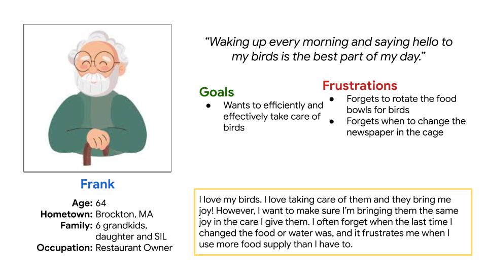
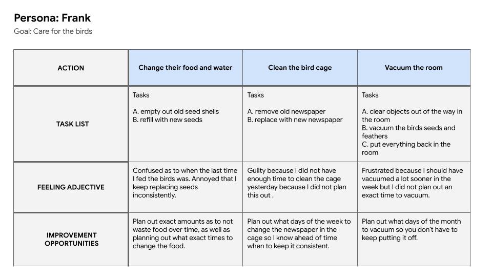
Frank is a long time owner of three parakeets, whom he loves very much. Sometimes, Frank will forget when he last changed the water and food for the birds. Often times he replaces the food too often, resulting in him throwing away good seeds the birds are still working on. He wishes there were a way he could keep track of the last time he replaced their food so that he doesn't go through bird food so quickly.
The goals of Chirp are to achieve the following:
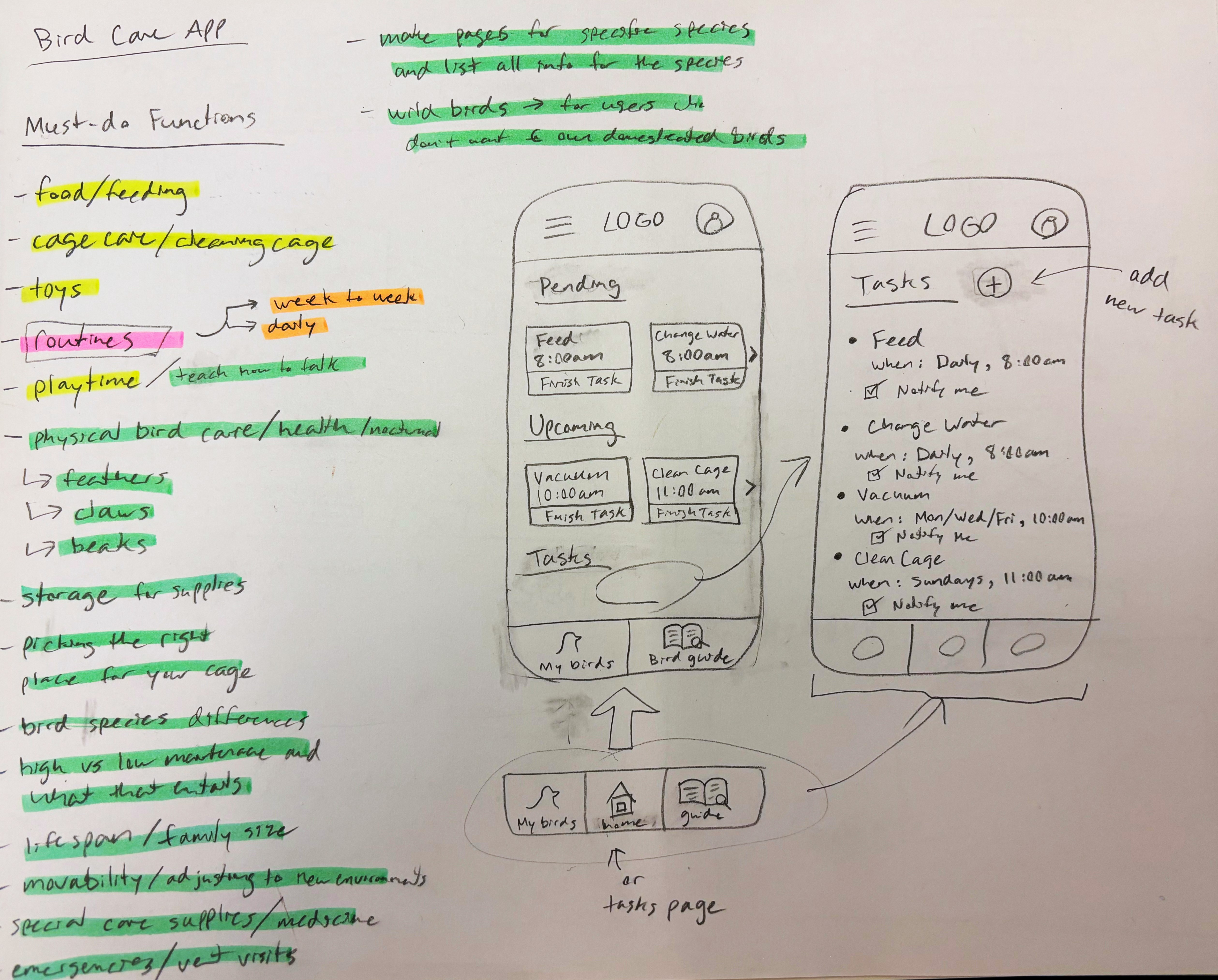
During the sketch process, I wanted to list the potential functions of the app with different essential bird maintenance tasks, and then organize them by category. I then started seeing how I could arrange the task cards on the homepage of the mobile version of the app, and I found some useful components and icons I definitely wanted to include in my lo-fi mockups.
I used a mobile-first approach since I felt that platform would be how users would access the application the most. Still, I planned to design a web version of the application for the sake of having more room for the bird guidance pages.
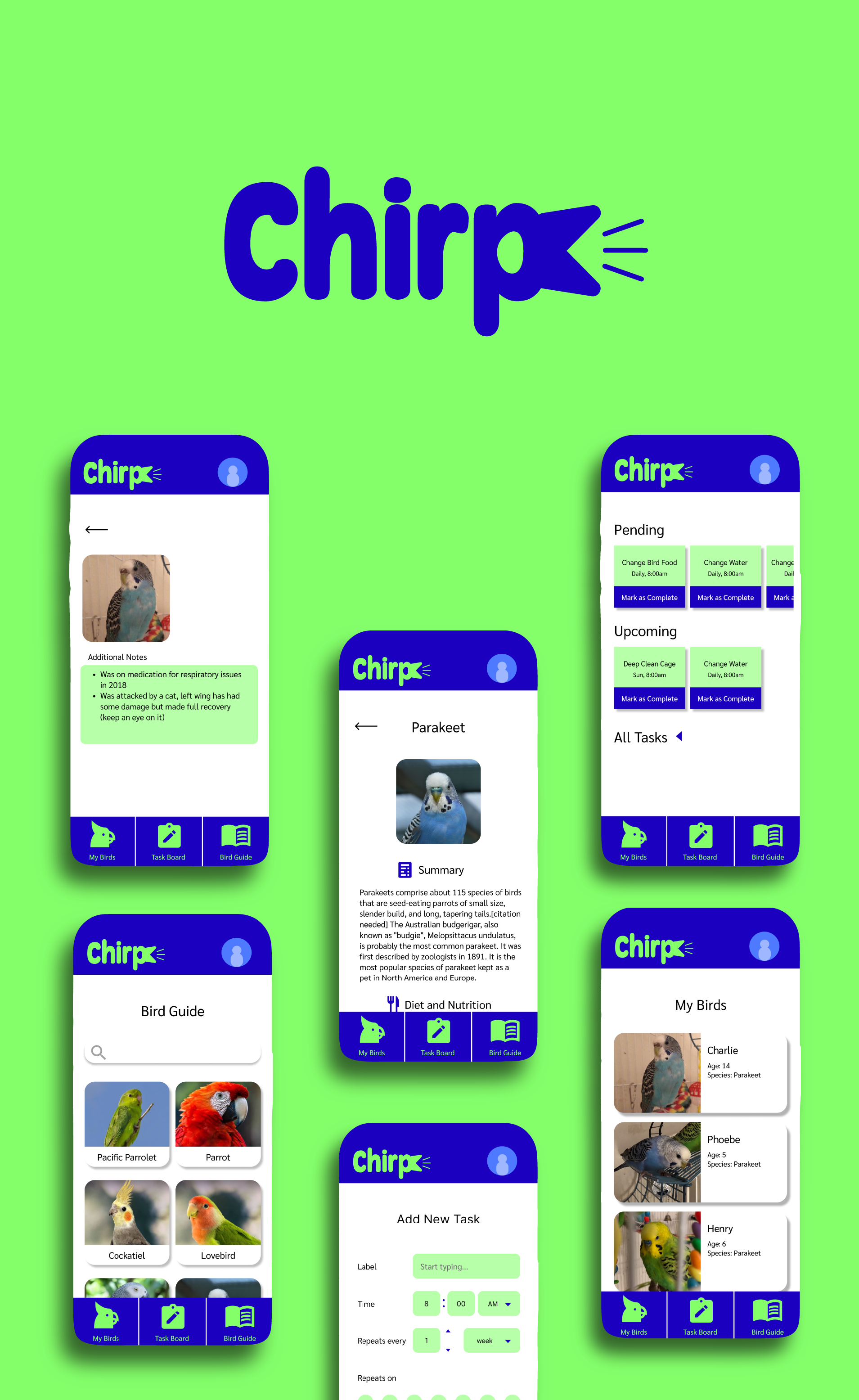
When designing the web version and mobile version, I knew I wanted to make the navigation section into buttons instead of a hamburger menu. I felt this made the most sense for a couple of reasons. First, the homepage is the Task Board, so I felt the other two paths (Bird Guide and My Birds) in the app did not need their own collapsable menu overlay. Second, I felt it would make the user’s experience easier since all of the app’s possible functions are right in front of them.
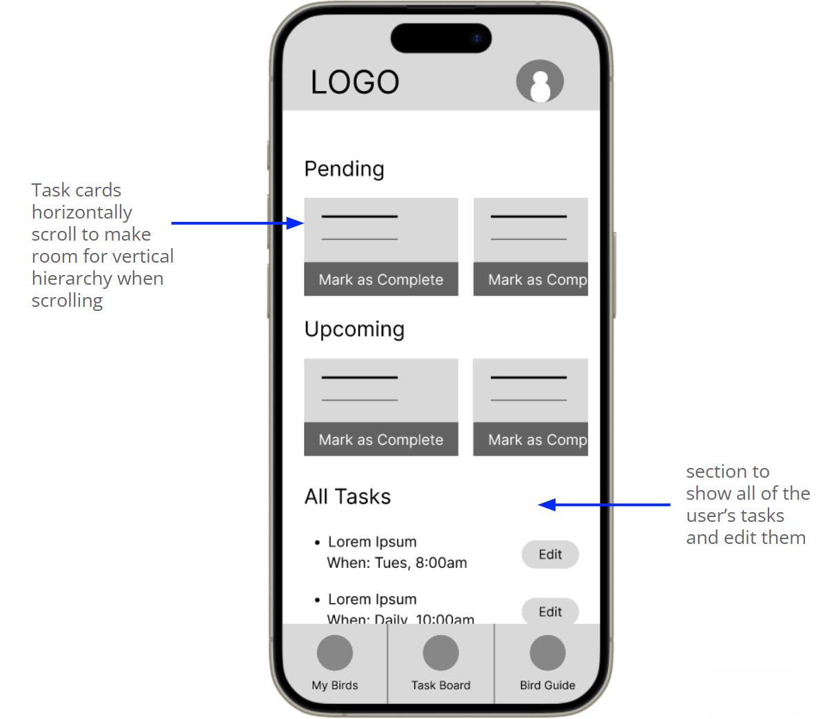
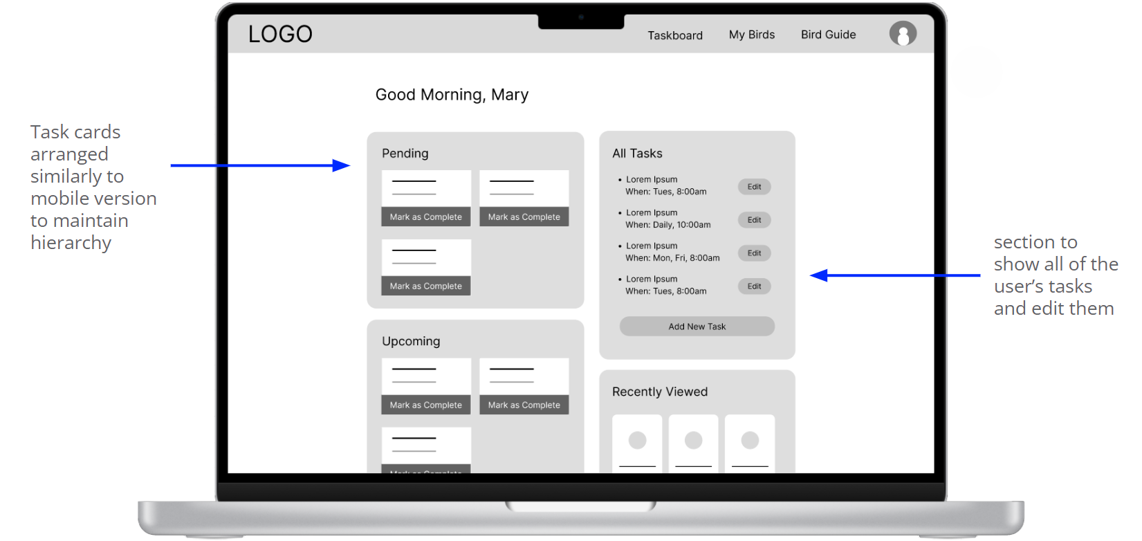
On the “Task Board” page, I wanted to make sure the task cards were the first thing users see, but also making sure they weren’t too large. In order to make different sections for the task cards, I made them horizontally scroll. This allowed me to create a hierarchy in “Pending”, “Upcoming” and “All Tasks” down the page.
Here I created the bare bones of the functional mobile and web app to see how it would run through different sequences of the user flow. In these prototypes, you’ll find many oversized buttons or wonky icons I later ironed out after plugging in actual content. Creating these lo-fi prototypes helped me fix those problem areas and create more breathable space in the final cut of the designs.
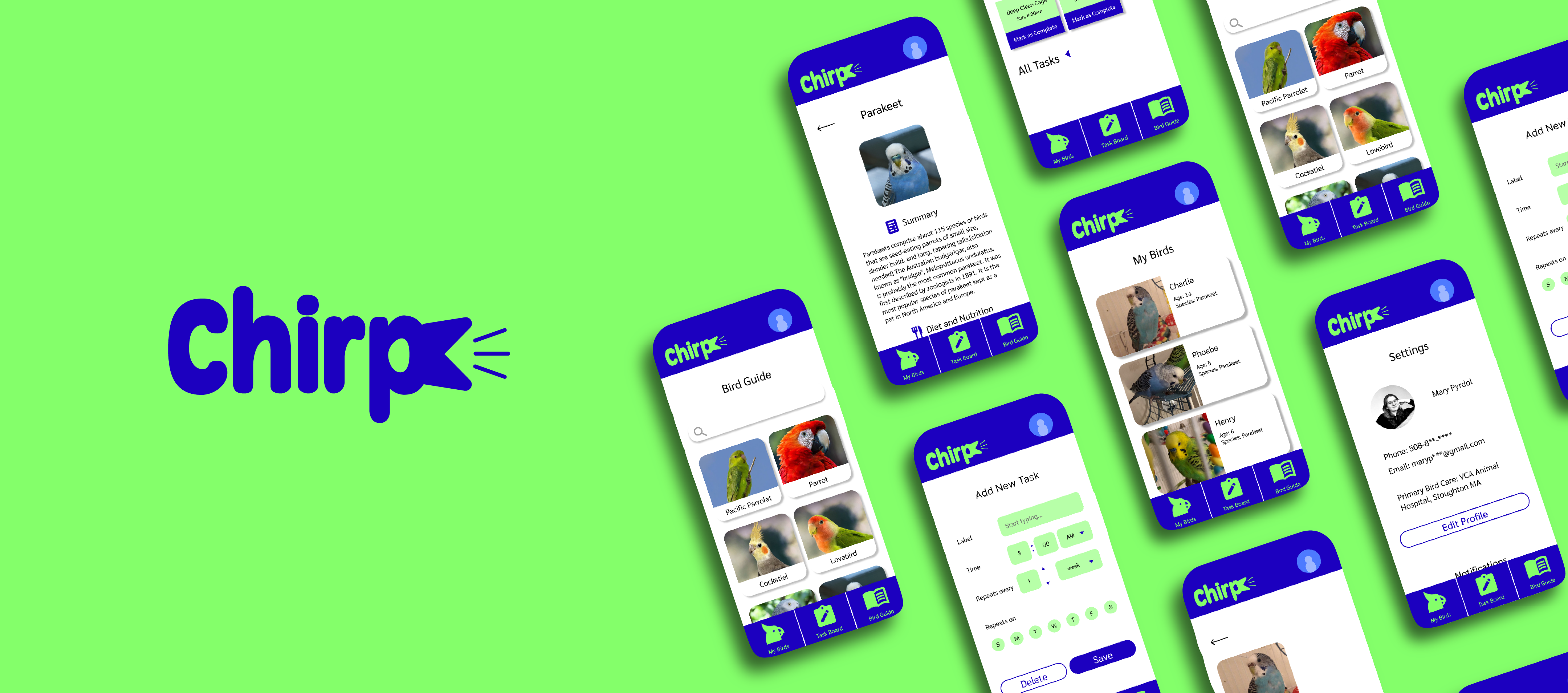
Low-Fidelity Mobile Prototype Low-Fidelity Web Prototype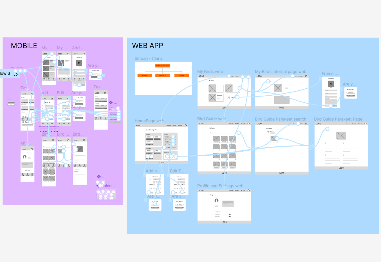
FINDINGS
These were my insights after conducting usability tests on my lo-fi prototypes:
Needs collapsable "All tasks" as to not confuse the user on the homepage
Profile page should be its own page and not just an overlay screen
Needs a way to add birds to "My Birds" section
Needs ability to change task repitition between days/weeks/months
The translation of the pages were pretty straightforward from the lo-fi prototype. For the homepage, I was able to test out the horizontal scroll to allow for that vertical hierarchy prioritizing pending tasks. I also made minor adjustments like the arrangement of elements on web-sized pages.
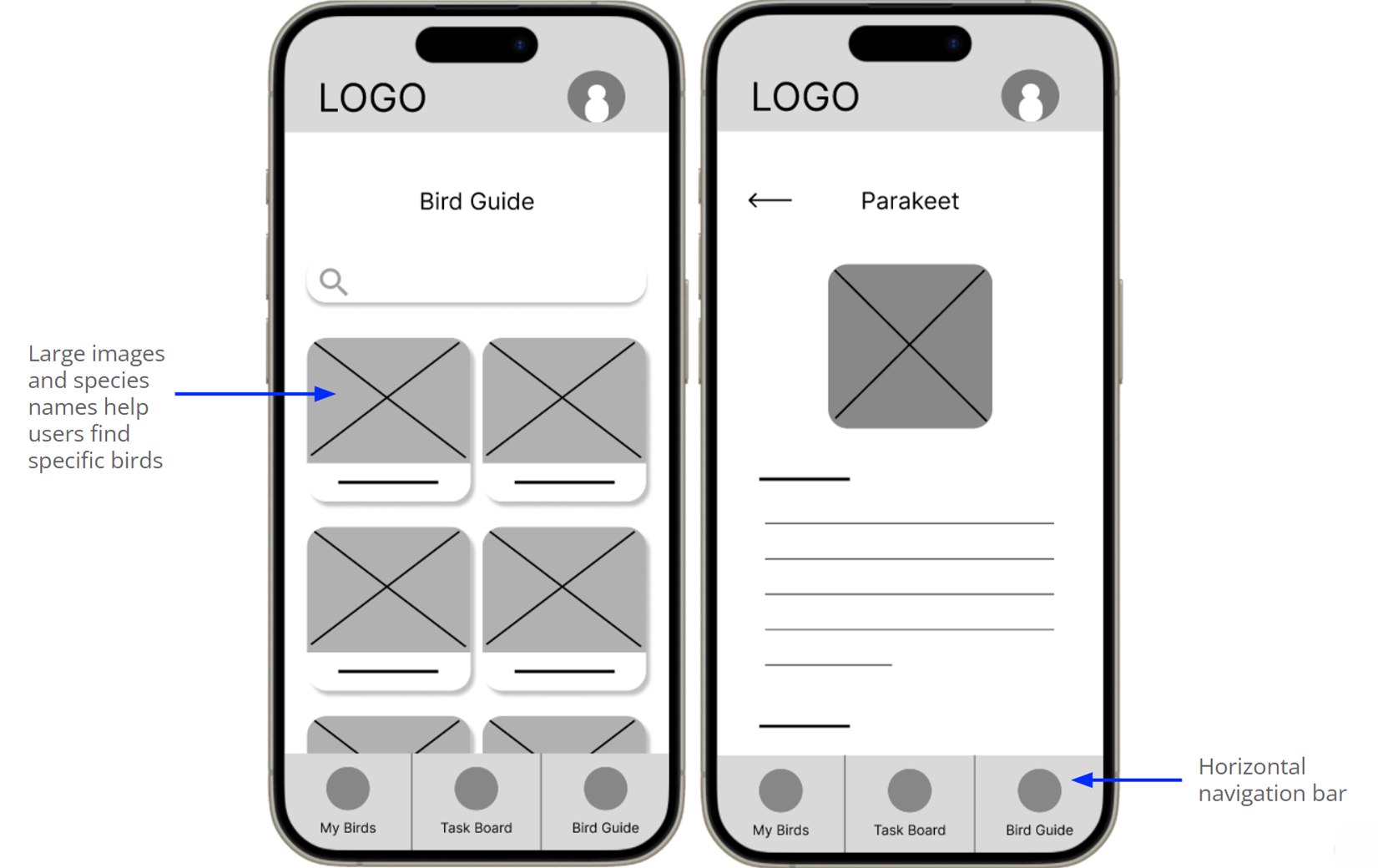
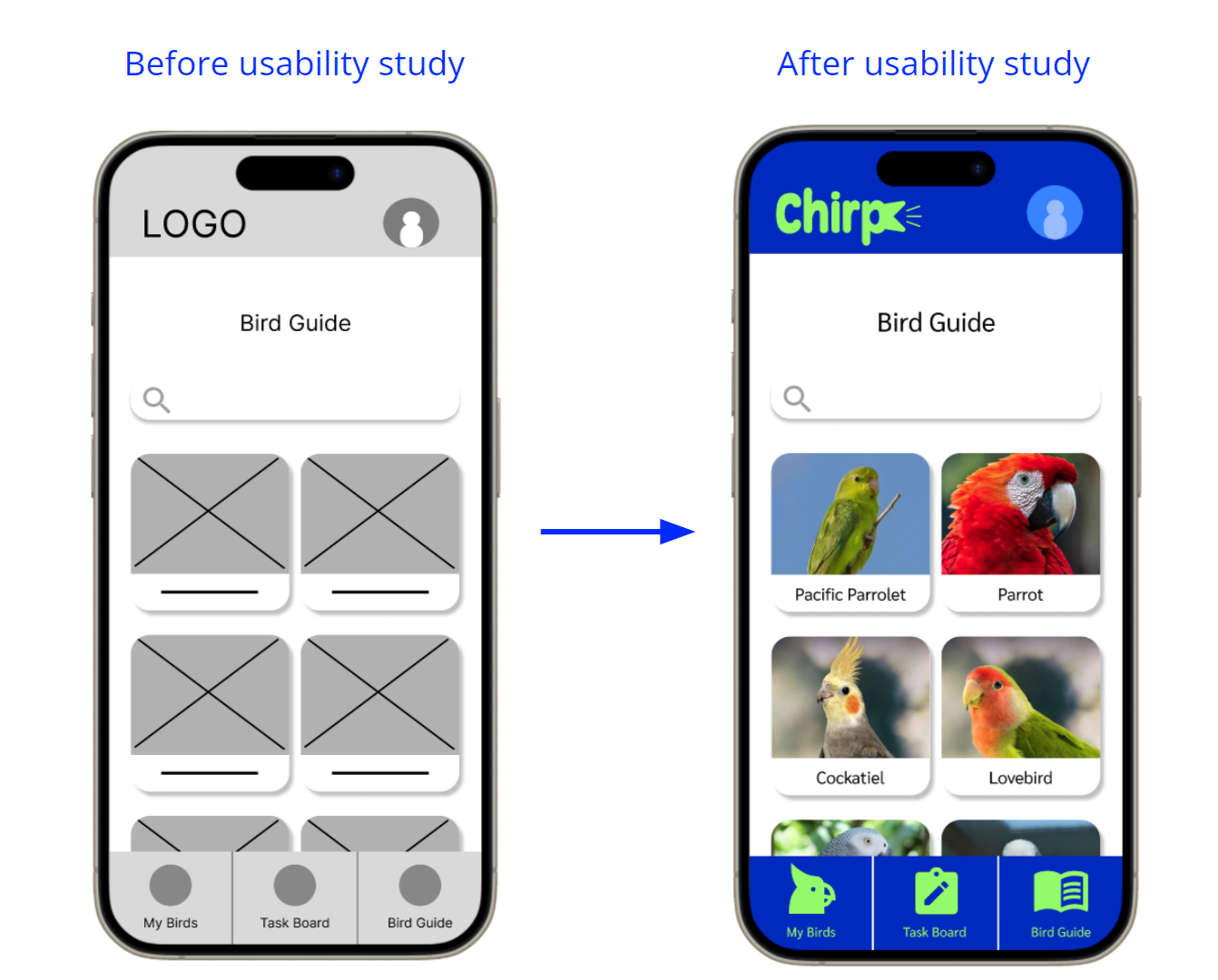
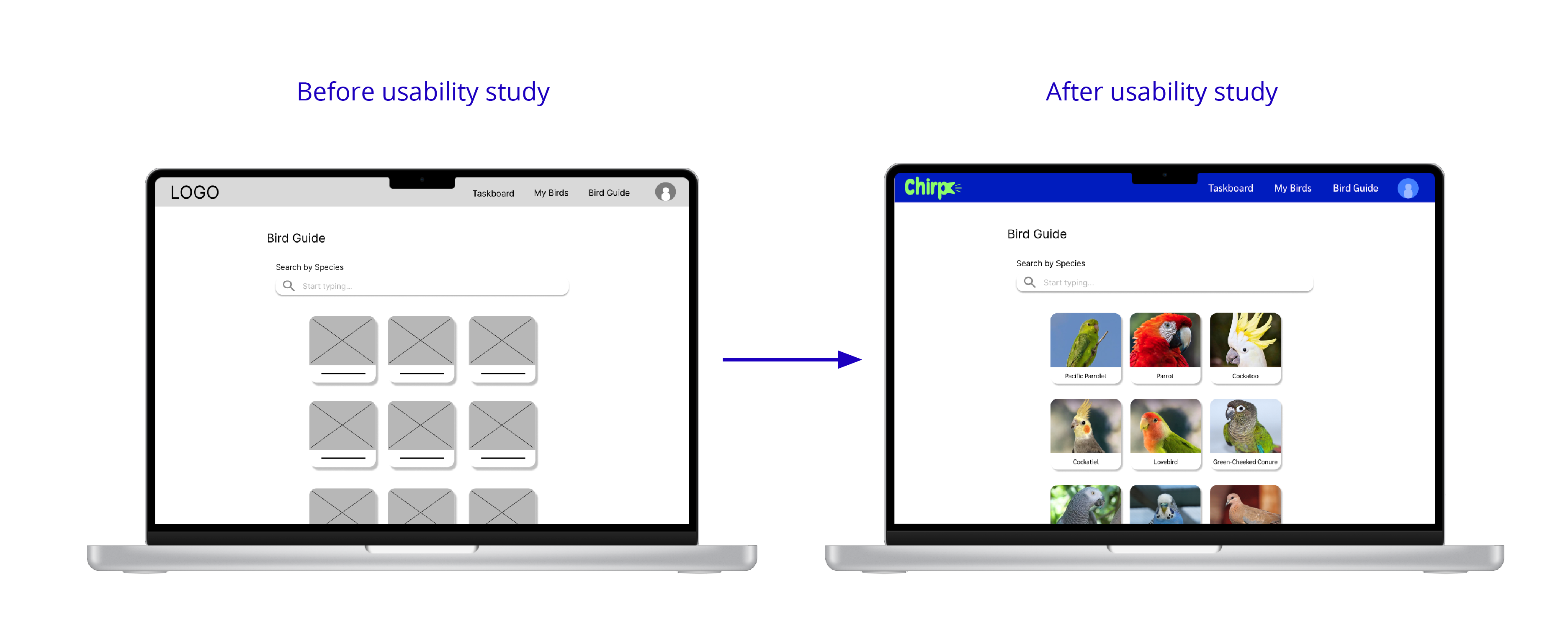
One of my biggest concerns was finding icons that were visually descriptive enough for the places I wanted to use them in. For example, on the Bird Guide internal page under “Parakeet”, I found some great icons like the broom for “Cleaning and Maintenance”.
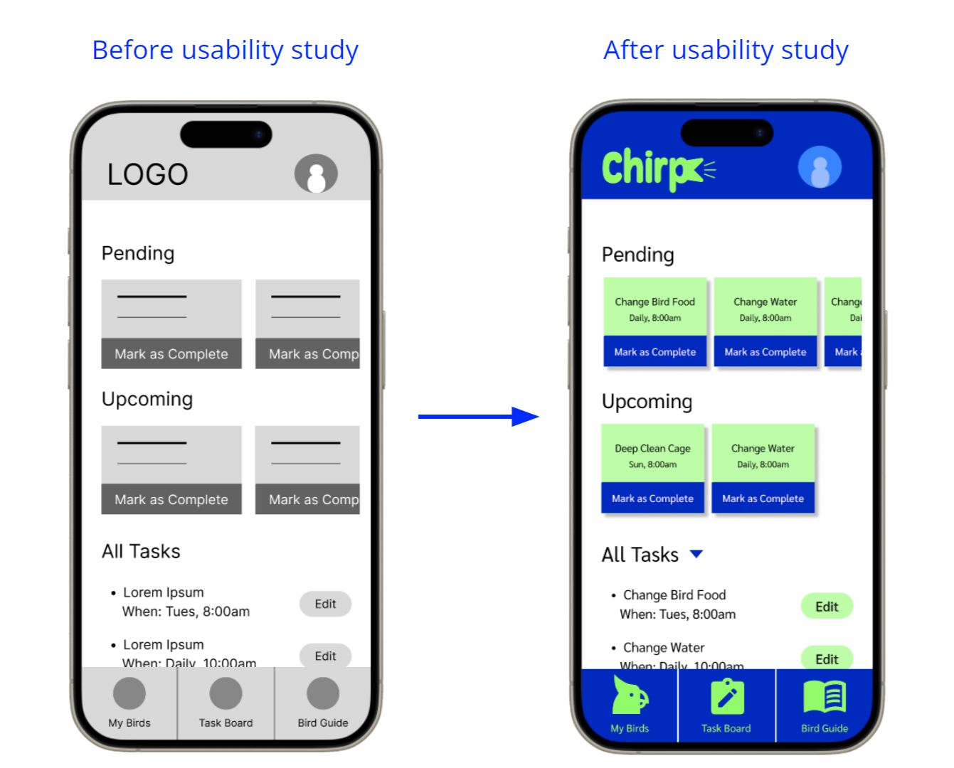
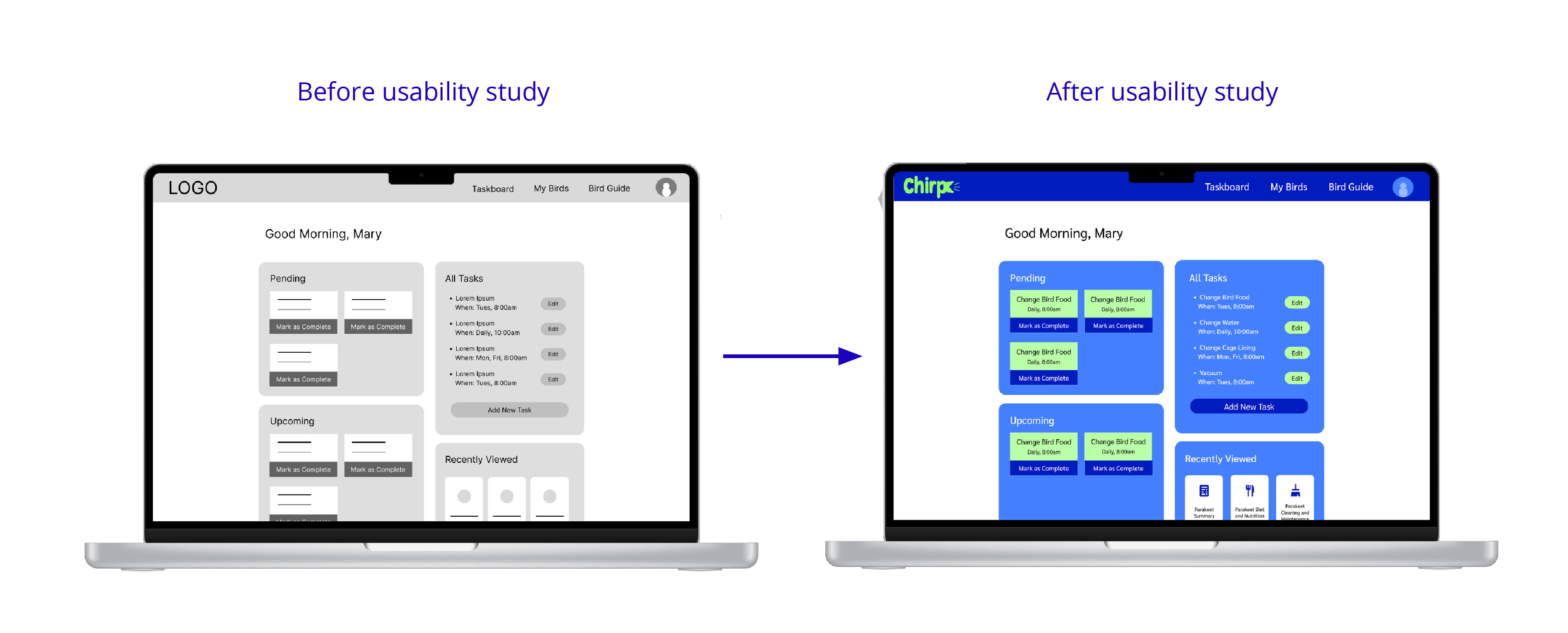
When moving onto the hi-fi mockups, I was concerned about using call-to-action buttons on the mobile homepage because I didn’t want it to feel too cluttered. I did, however, want to get the user’s attention and make it as easy as possible to see pending tasks and mark them as complete. I utilized the text size and good contrasting colors from my palette and landed on the current UI chips.
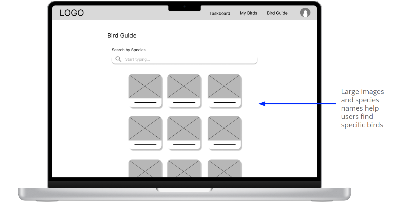
I also made sure to make the images of birds prominent on the Bird Guide to help users find specific species, and also add some color and variation to that page (since the other pages are mainly about displaying data or scheduling).
Finally I gathered my revised mockups and implemented functional transitions to create the hi-fi prototype. For the homepage, I was able to test out the horizontal scroll to allow for that vertical hierarchy prioritizing pending tasks. I also made minor adjustments like the arrangement of elements on web-sized pages.
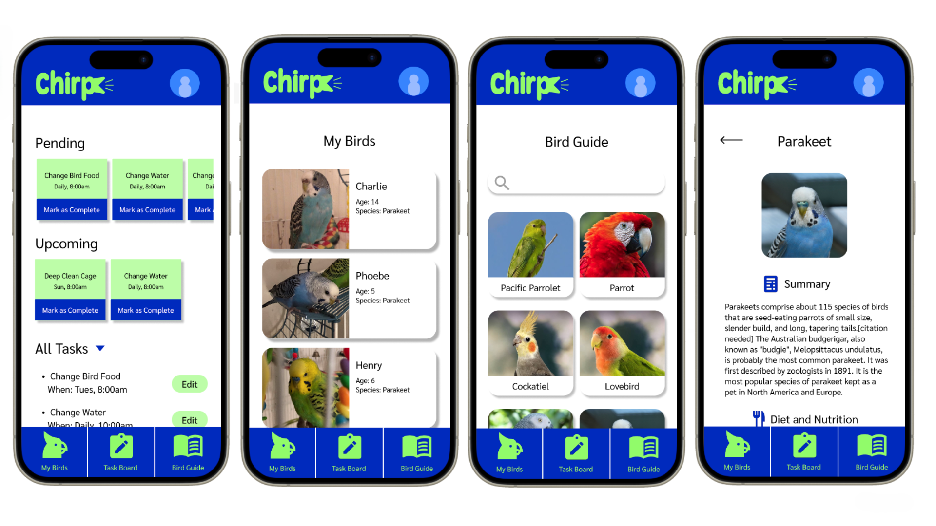
High-Fidelity Mobile Prototype High-Fidelity Web Prototype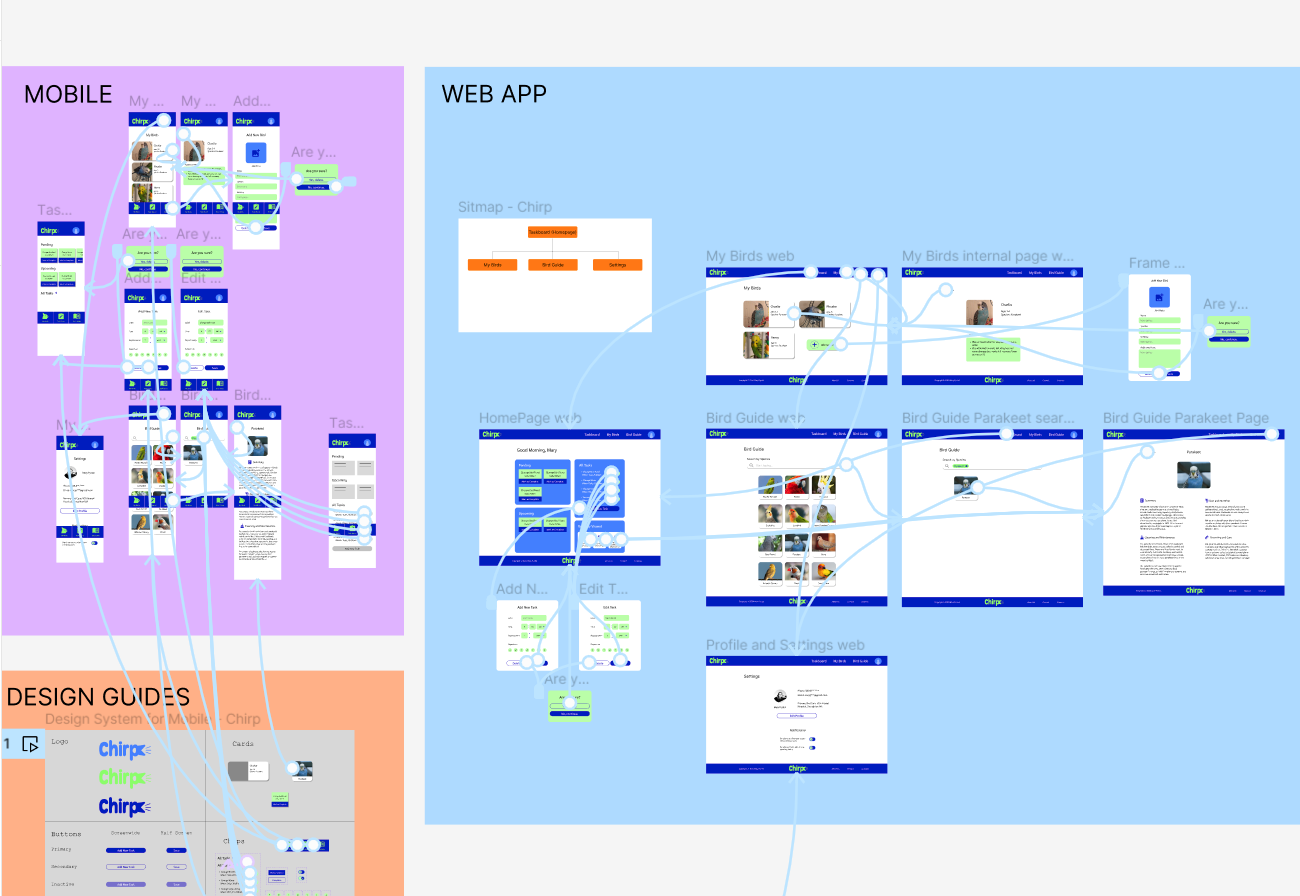
Here are a few main accessibility points I heavily considered while prototyping:
I made sure to make iconography and buttons large enough for people to access them. Often times I've seen iconography too small to comprehend or touch, thus making it difficult for the user to interact with the mechanics of the app.
Contrast was a major one here. I wanted to be able to use Chirp's color palette as a nod to common parakeet colors, while also keeping in mind how well the light colors show up on darks and vise versa. This especially applied to the call-to-action buttons.
I utilized hierarchical headings in order for assistive devices like screen readers to navigate and translate the app's features and designs more accurately to the user.
IMPACT
“Chirp would SO help me carve out time in my day to consistently manage bird-related things. Birds should get the care they deserve!”
-a satisfied user
WHAT I LEARNED
From this project, I learned a lot about how to solidify branding across the product. I really think it often comes down to the color palette you're working with and how you plan out where to use the primary versus secondary colors. I also learned a lot about Figma's component creation capabilities. Especially on the screens where I allow users to create a new task card, I practiced components with dropdown sections like the AM/PM on the "time" section, or day/month/year in the "repeats" section.
After designing this first prototype of what could be a very useful tool, I got to brainstormign how I could expand Chirp in future "updates" upon release: