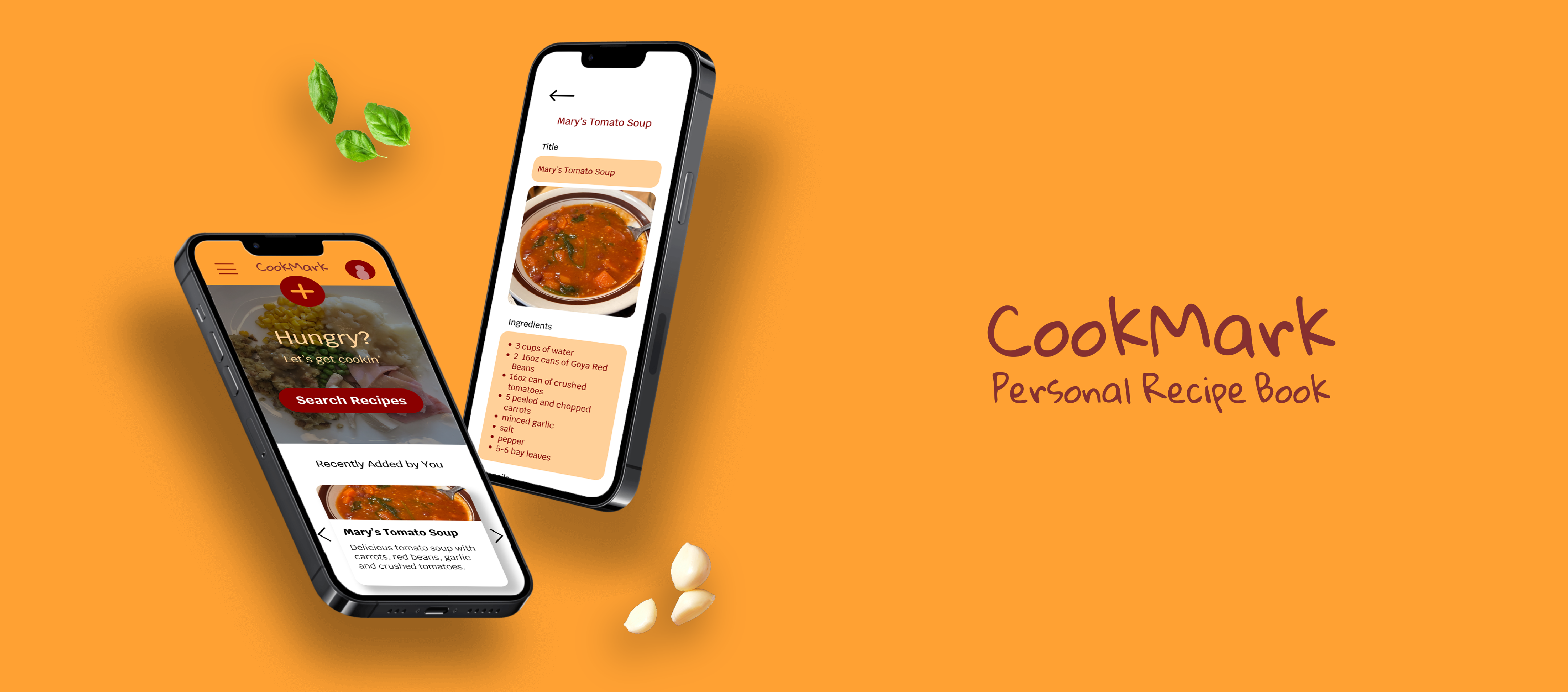
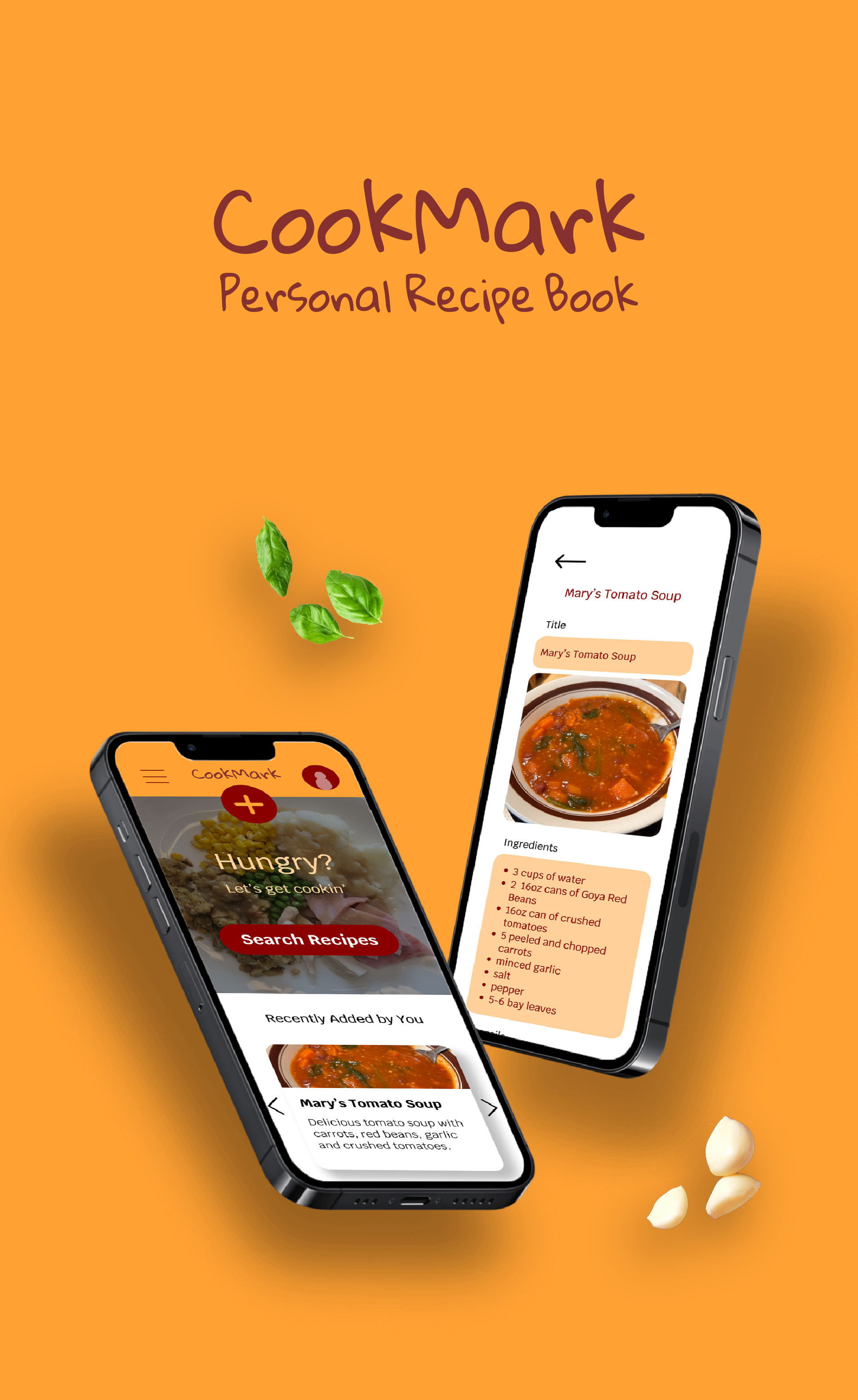


CookMark is a web and mobile application designed to help users save and share recipes, from friends' recommendations to beloved family favorites across generations.
THE PROBLEM
Recipes are saved in all random places and often lost in bad handwriting, poor communication, or worn down recipe cards.
THE GOAL
Generate a way to keep all recipes in one place and easy to share with others.
ROLES
Mary Pyrdol - Sole UX/UI designer and researcher.
RESPONSIBILITIES
User research, wireframing, prototyping, user testing.
PROJECT DURATION
January 2024 - February 2024
SUMMARY
For my recipe-organizing app, I conducted a competitive audit to see what has already been done to organize and share recipes digitally. I wanted to do my research this way because I was mainly concerned about how other apps displayed recipes to the user.
Going into this research, I assumed formats for these apps would be very similar in layout and color, but I was pleasantly surprised to find many different ways apps displayed the data and visual themes for “food”. I got to see what I felt worked and what I felt didn’t in terms of these elements. This gave me insight for when I decide on color and layout for my app.
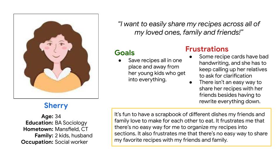
Users wants to prevent losing recipes to bad handwriting, poor communication, or deterioration.
Users want to be able to easily share recipes with friends without having to send long-winded letters or text messages.
Users want a place to organize their recipes by occasion, preference, and more.
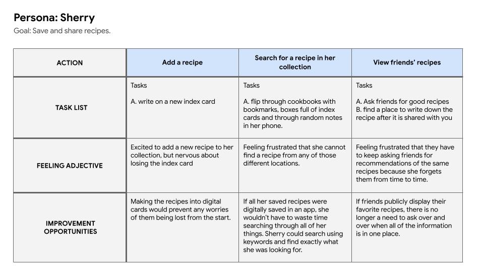
Sherry is a mother of two young kids who needs a good place to store her recipes because she fears the physical recipe cards could get damaged and she could lose the recipes. If she can store her recipes digitally, she doesn't have to worry about physical paper recipes deteriorating over time, especially in the hands of her kids!
The goals of CookMark are to simplify the processes of the following:
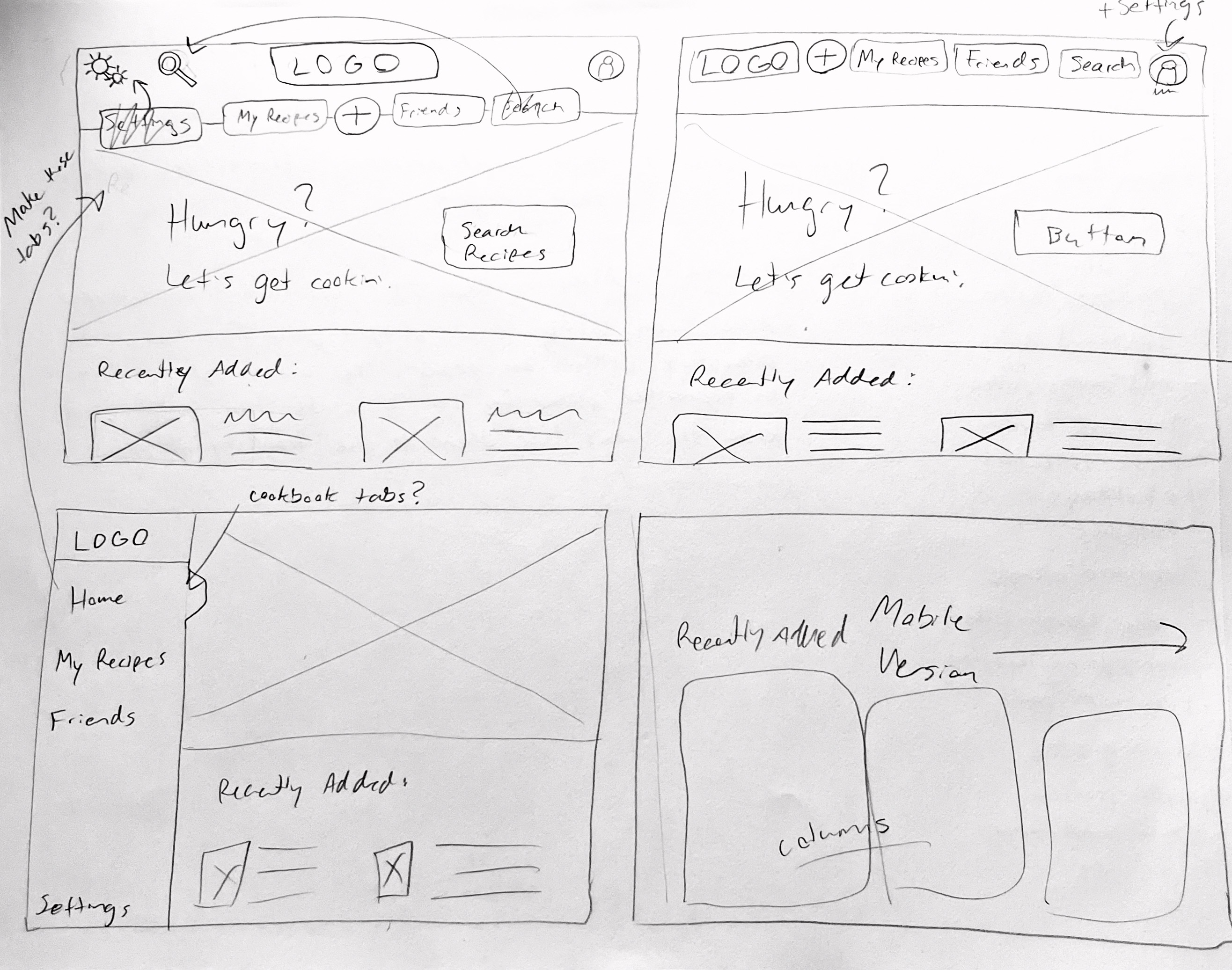
During the sketch process, I wanted to get down as many ideas as possible in one instance, and then Frankenstein the best parts of those different iterations together. I started this process with the homepage of the web version of the app, and I found some useful components and icons I definitely wanted to include in my lo-fi mockups.
I want to say I started with a mobile first approach, but my paper wireframes for the website were what initially inspired me to start making mockups for the mobile version of the application.
When designing the web version and mobile version, I knew I wanted to take advantage of call-to-action buttons. I want to encourage the user and make it as easy as possible to add recipes to their collection(s).
On the “Add New Recipe” page, I wanted to be accessible for people with very specific dietary restrictions. I added sections like “allergy Information” for users to add notes such as “gluten free” or “contains peanuts”.
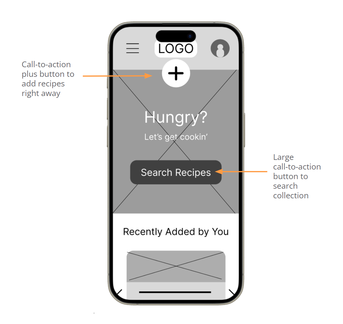
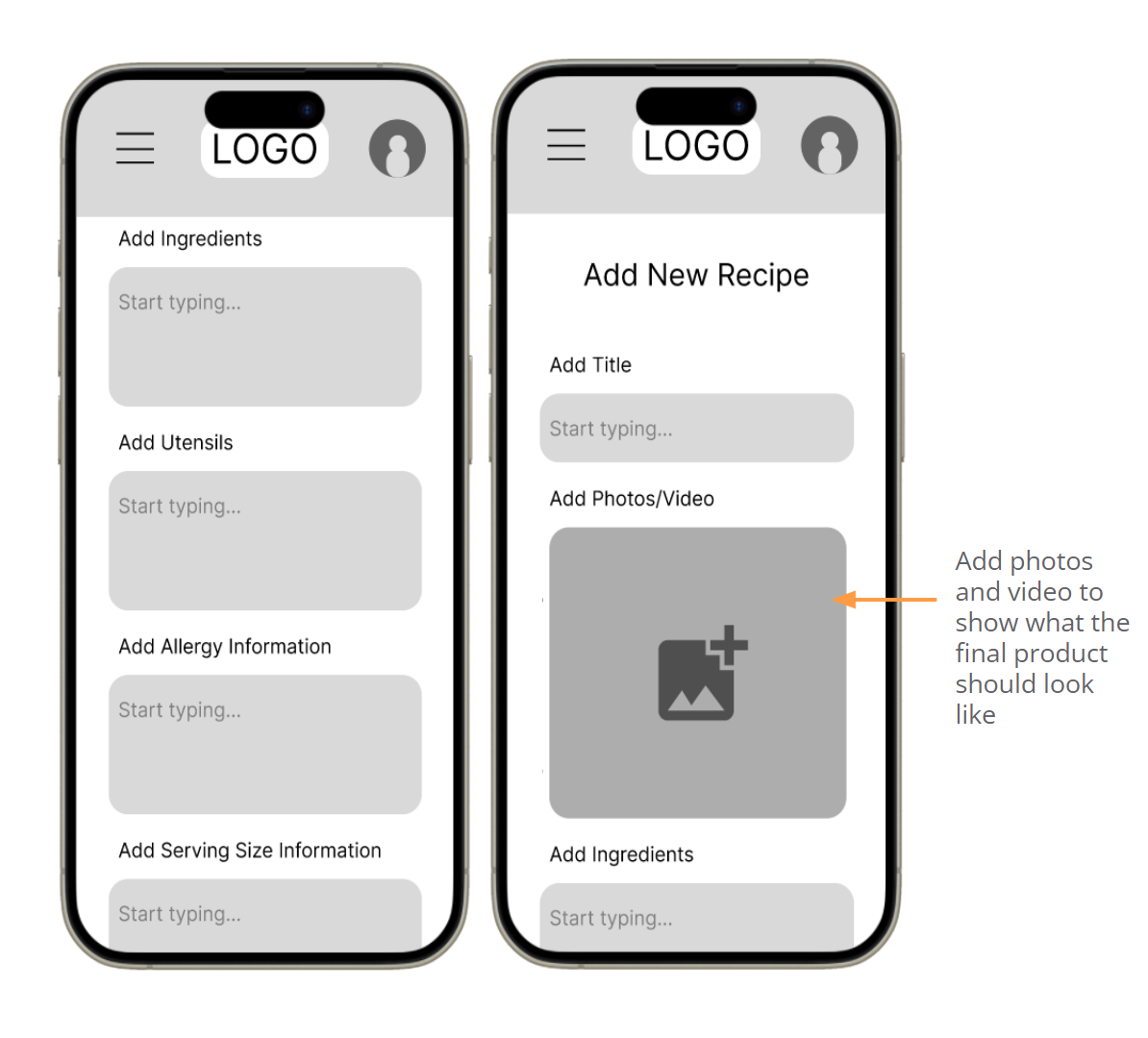
Here I created the bare bones of the functional mobile and web app to see how it would run through different sequences of the user flow. In these prototypes, you'll find many oversized buttons or wonky icons I later ironed out after plugging in actual content. Creating these lo-fi prototypes helped me fix those problem areas and create more breathable space in the final cut of the designs.
Low-Fidelity Mobile Prototype Low-Fidelity Web PrototypeFINDINGS
These were my insights after conducting usability tests on my lo-fi prototypes:
Needs bookmarking ability from all screens where you can see recipes
Profile page should be its own page and not just an overlay screen
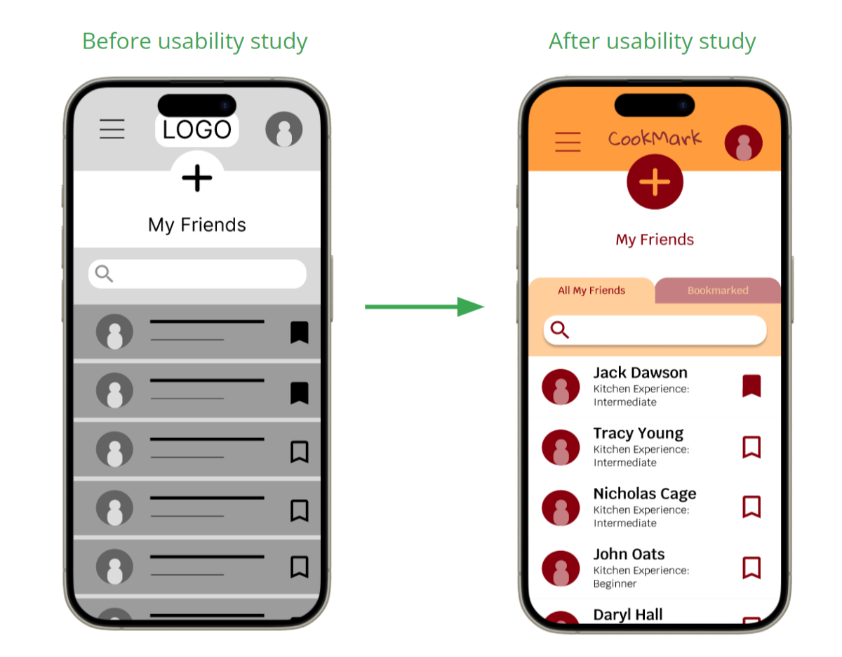
Needs a way to distinguish bookmarked friends vs unbookmarked friends
Needs ability to delete recipes
The translation of the homepage was pretty straightforward from the lo-fi prototype. I was able to test out contrast for the call-to-action buttons and really make them pop. I also fixed minor adjustments like the logo clearing the iPhone hotbar (which should also clear other widgets on other devices).
The “My Friends” page had some major improvements. I implemented a tabs function, where users can flip between seeing all of their friends and just their bookmarked friends. Users will want to bookmark their favorite users when they have consistently good recipes, especially grandma's.
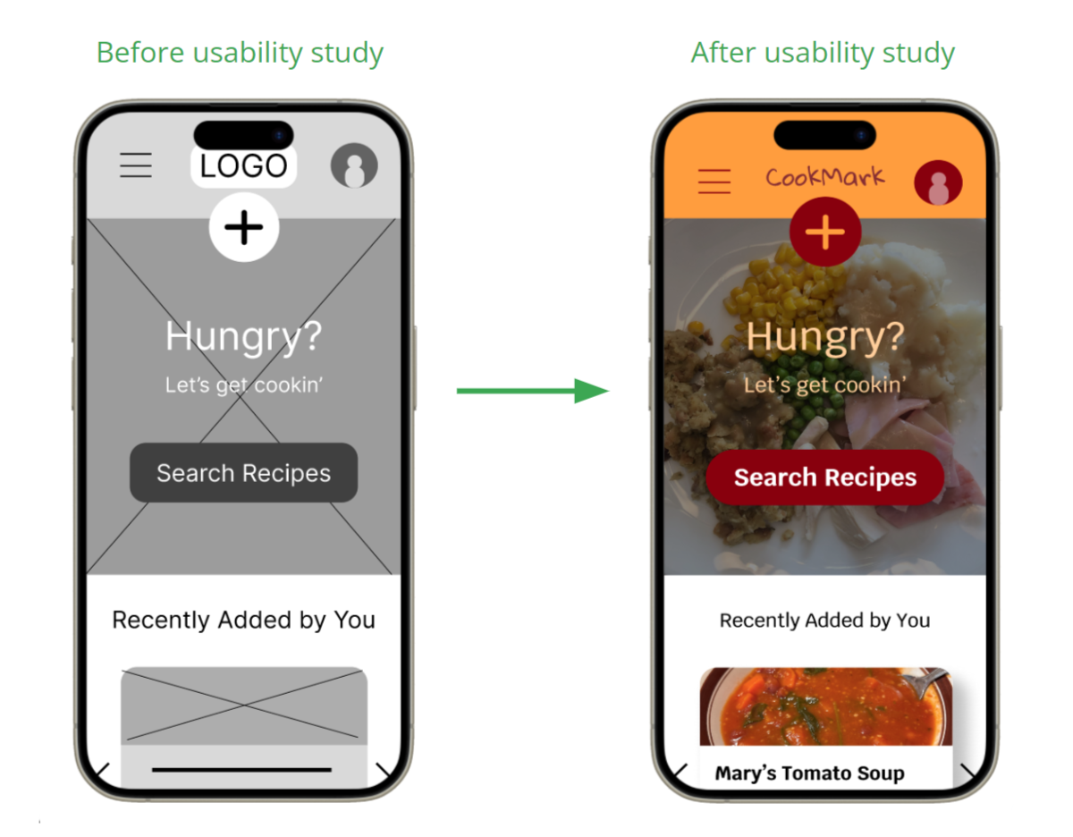
When moving onto the high fidelity mockups, I knew I wanted to take advantage of call-to-action buttons. I want to encourage the user and make it as easy as possible to add recipes to their collection(s).
I also made sure to make the images of food part of the most prominent details on each page so that it would spark interest in the user. Usually seeing photography of food will help users make their decisions on what to cook.
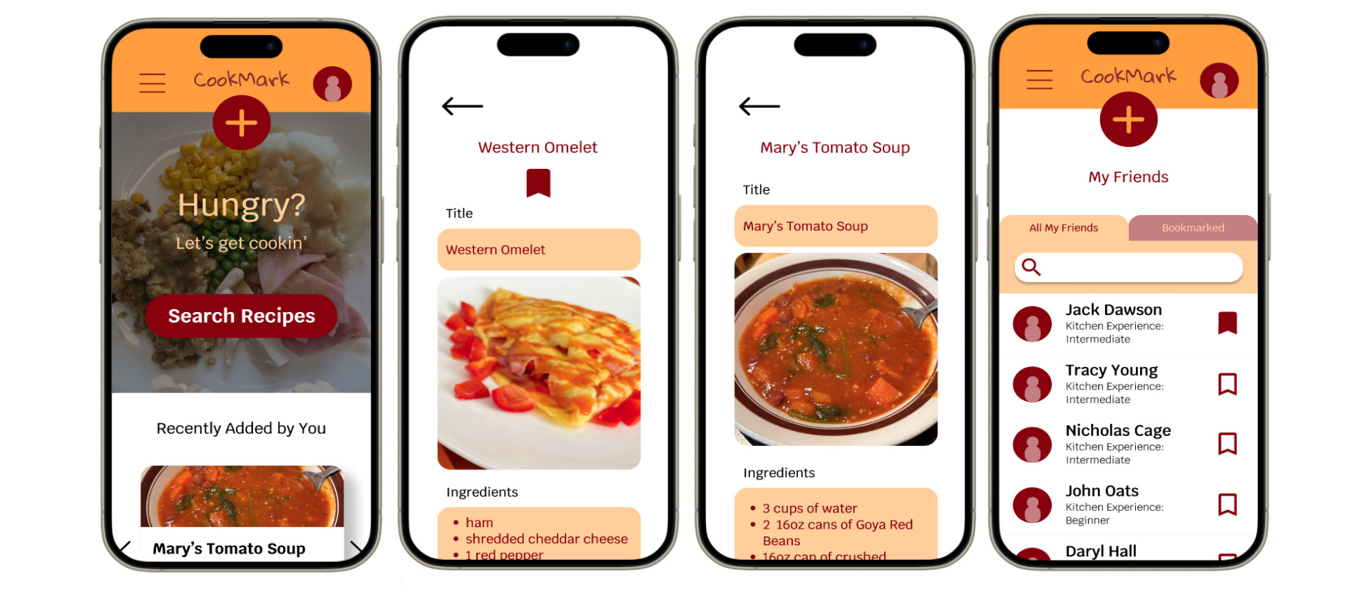
Finally I gathered my revised mockups and implemented functional transitions to create the hi-fi prototype. In these prototypes, you'll be able to navigate between pages to get a feel for how CookMark's visual identity meshed with its functionality.
High-Fidelity Mobile Prototype High-Fidelity Web PrototypeHere are a few main accessibility points I heavily considered while prototyping:
I made sure to make iconography and buttons large enough for people to access them. Often times I've seen iconography too small to comprehend or touch, thus making it difficult for the user to interact with the mechanics of the app.
Contrast was a major one here. I wanted to be able to use CookMark's color palette and have it inspire the idea of cooking, while also keeping in mind how well the light colors show up on darks and vise versa. This especially applied to the call-to-action buttons.
I utilized hierarchical headings in order for assistive devices like screen readers to navigate and translate the app's features and designs more accurately to the user.
IMPACT
“This app would be great for keeping all of my recipes in one place. No more taping random sheets of paper to the inside of my kitchen cabinets!”
-a satisfied user
WHAT I LEARNED
From this project, I learned how to really simplify my designs. I often overthink the sketching phase, but I utilized that energy and put it towards making iterations to inform one final product. I also learned about how crucial it is to have the functions within the app intertwined between screens. You cannot have the user stuck at a dead-end. There are always navigational options.
After designing this first prototype of what could be a very useful tool, I got to brainstormign how I could expand CookMark in future "updates" upon release: