Die Fledermaus Overture is a piece written by Johann Strauss II summarizing the story of the operetta, Die Fledermaus. I wanted to use this piece of classical music for my sound because I hear the most elaborate stories told through classical music. In reminiscing about Walt Disney’s Fantasia, I too wanted to animate the story of a song. For the overture, my partner and I decided to identify six main themes of the piece for us to visualize in our animation. My design partner covered designing for the topics of intoxication, gossip, and laughter. For my portion of the project, and for the second half of the operetta, I covered designing for the three themes of romance, drama, and celebration.
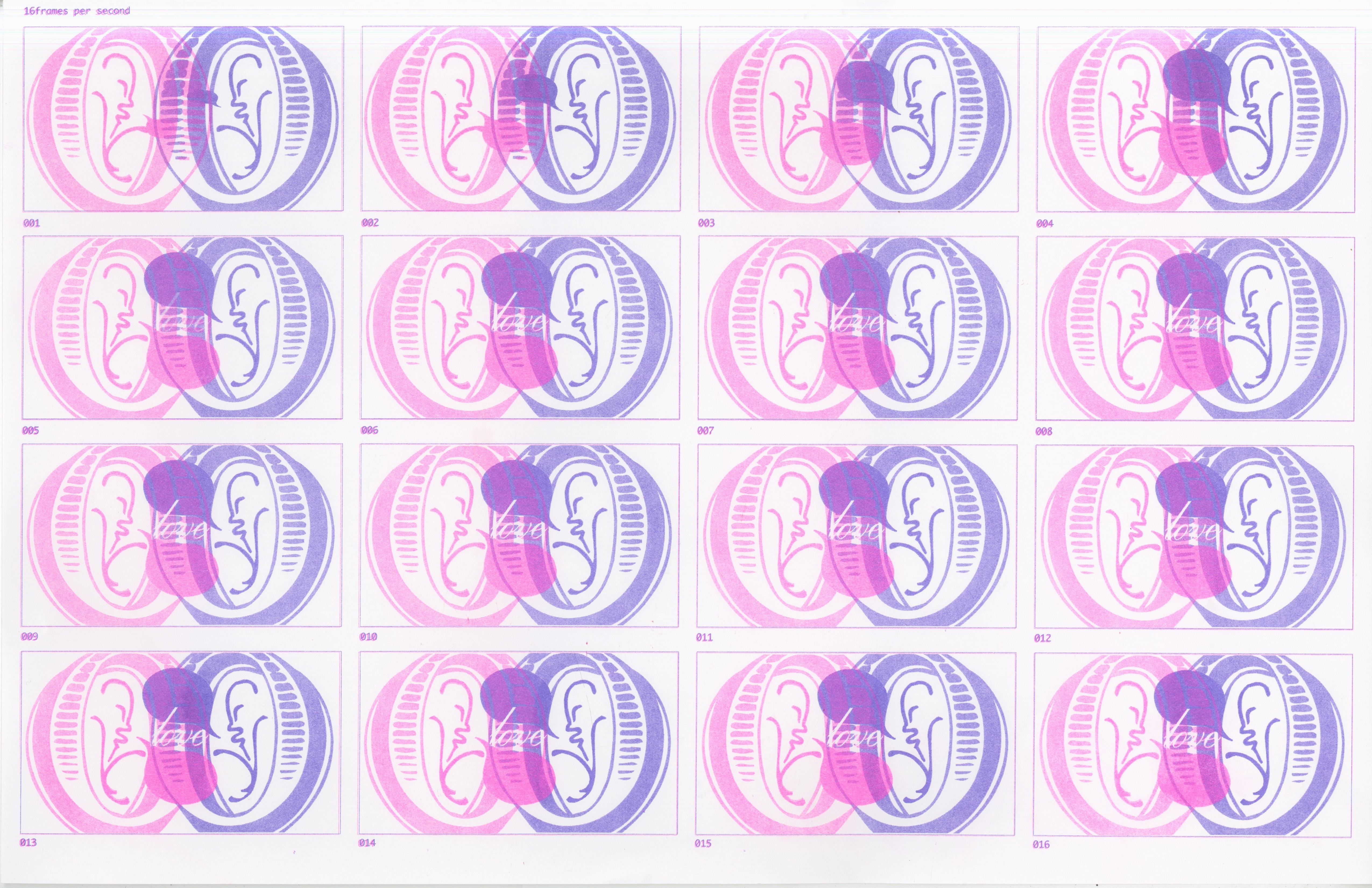
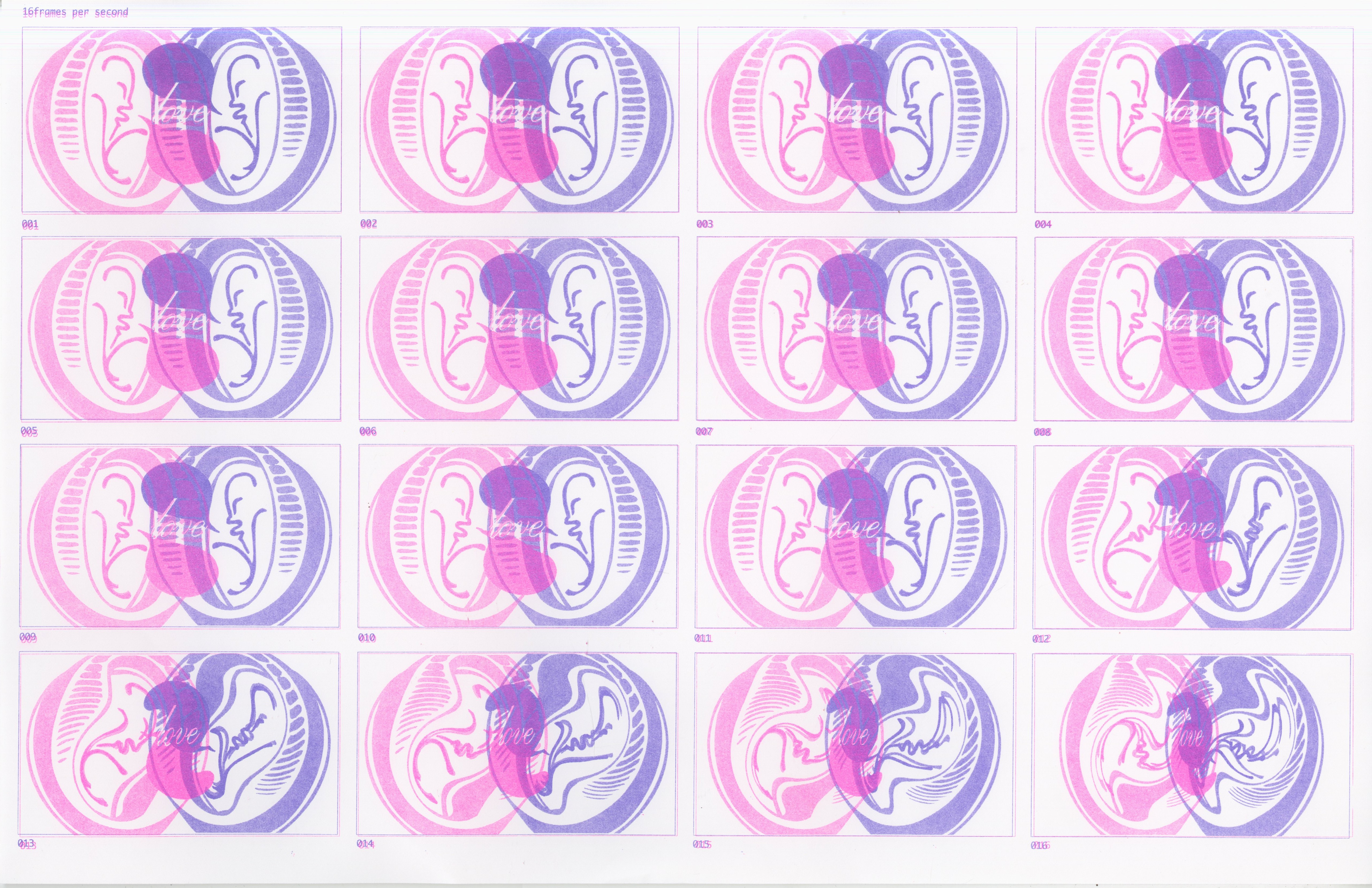
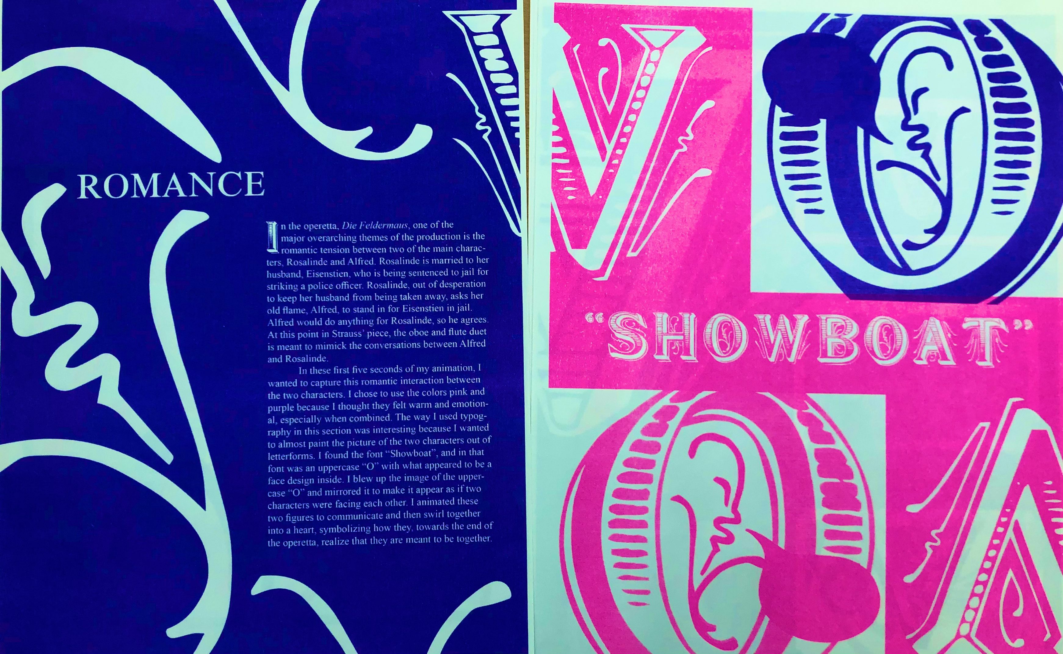
In the operetta, Die Fledermaus, one of the major overarching themes of the production is the romantic tension between two of the main characters, Rosalinde and Alfred. Rosalinde is married to her husband, Eisenstien, who is being sentenced to jail for striking a police officer. Rosalinde, out of desperation to keep her husband from being taken away, asks her old flame, Alfred, to stand in for Eisenstien in jail. Alfred would do anything for Rosalinde, so he agrees. At this point in Strauss’ piece, the oboe and flute duet is meant to mimic the conversations between Alfred and Rosalinde.
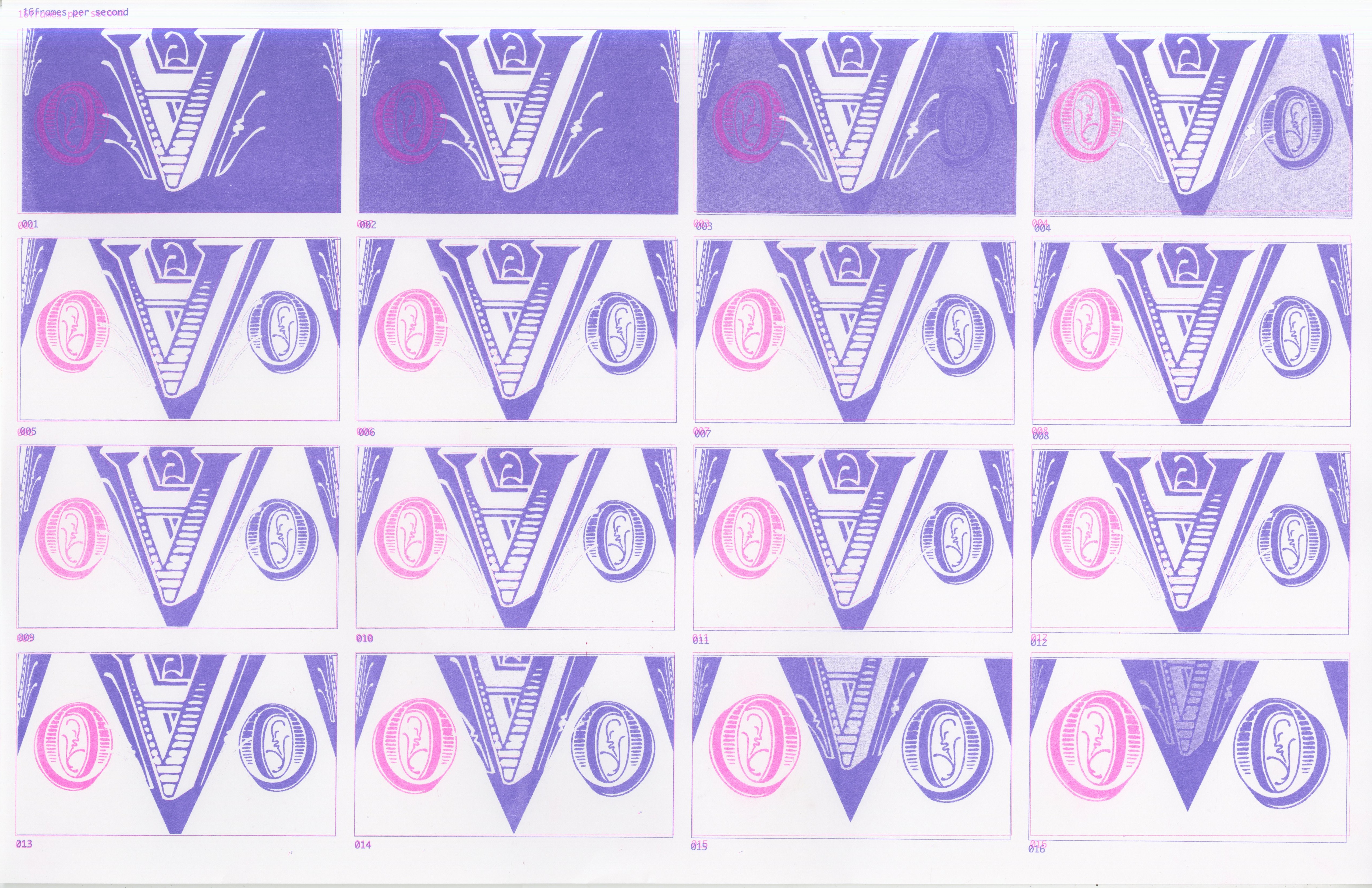
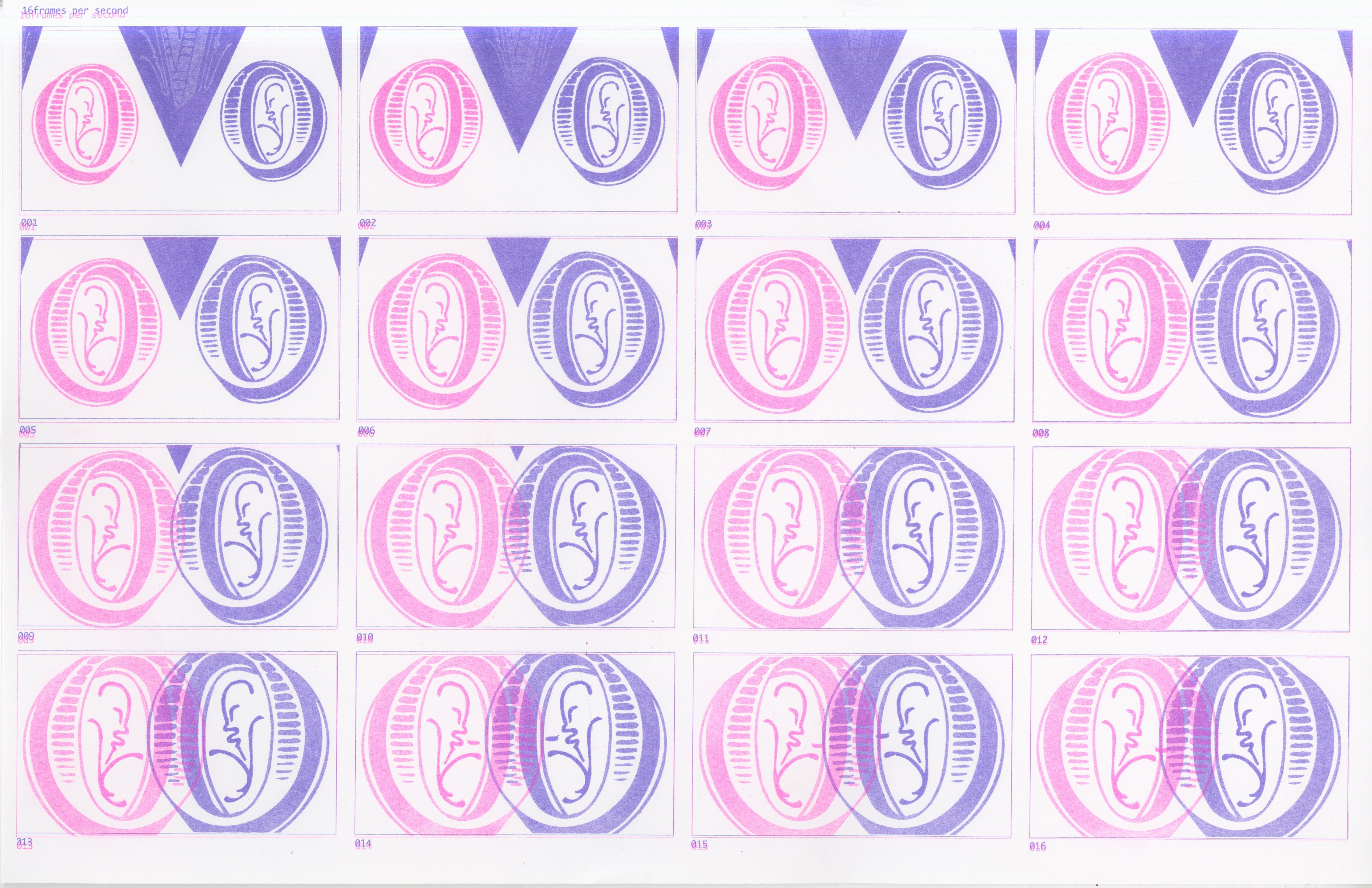
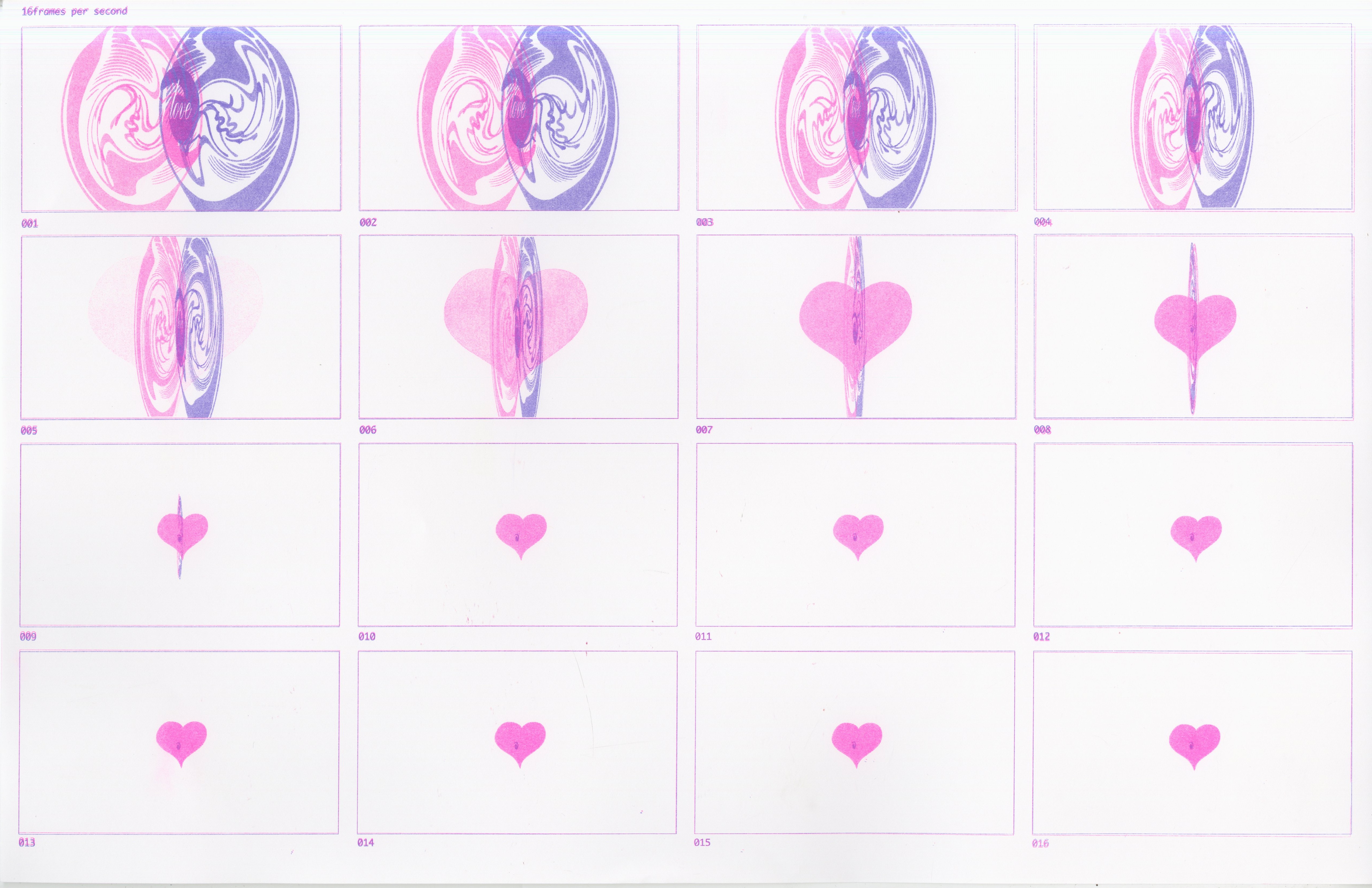
In these first five seconds of my animation, I wanted to capture this romantic interaction between the two characters. I chose to use the colors pink and purple because I thought they felt warm and emotional, especially when combined. The way I used typography in this section was interesting because I wanted to almost paint the picture of the two characters out of letterforms. I found the font “Showboat”, and in that font was an uppercase “O” with what appeared to be a face design inside. I blew up the image of the uppercase “O” and mirrored it to make it appear as if two characters were facing each other. I animated these two figures to communicate and then swirl together into a heart, symbolizing how they, towards the end of the operetta, realize that they are meant to be together.
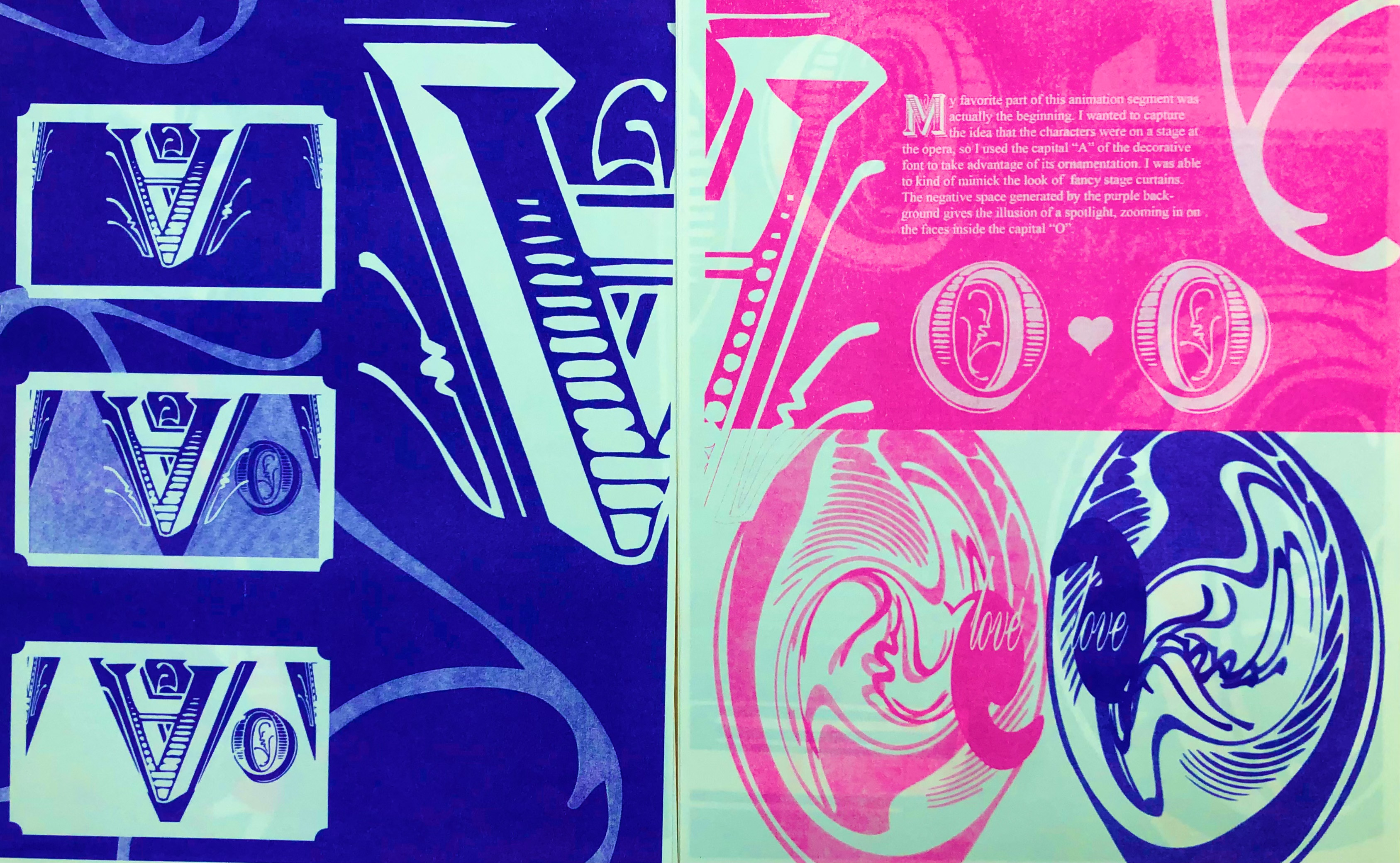
My favorite part of this animation segment was actually the beginning. I wanted to capture the idea that the characters were on a stage at the opera, so I used the capital “A” of the decorative font to take advantage of its ornamentation. I was able to kind of mimic the look of fancy stage curtains. The negative space generated by the purple background gives the illusion of a spotlight, zooming in on the faces inside the capital “O”.
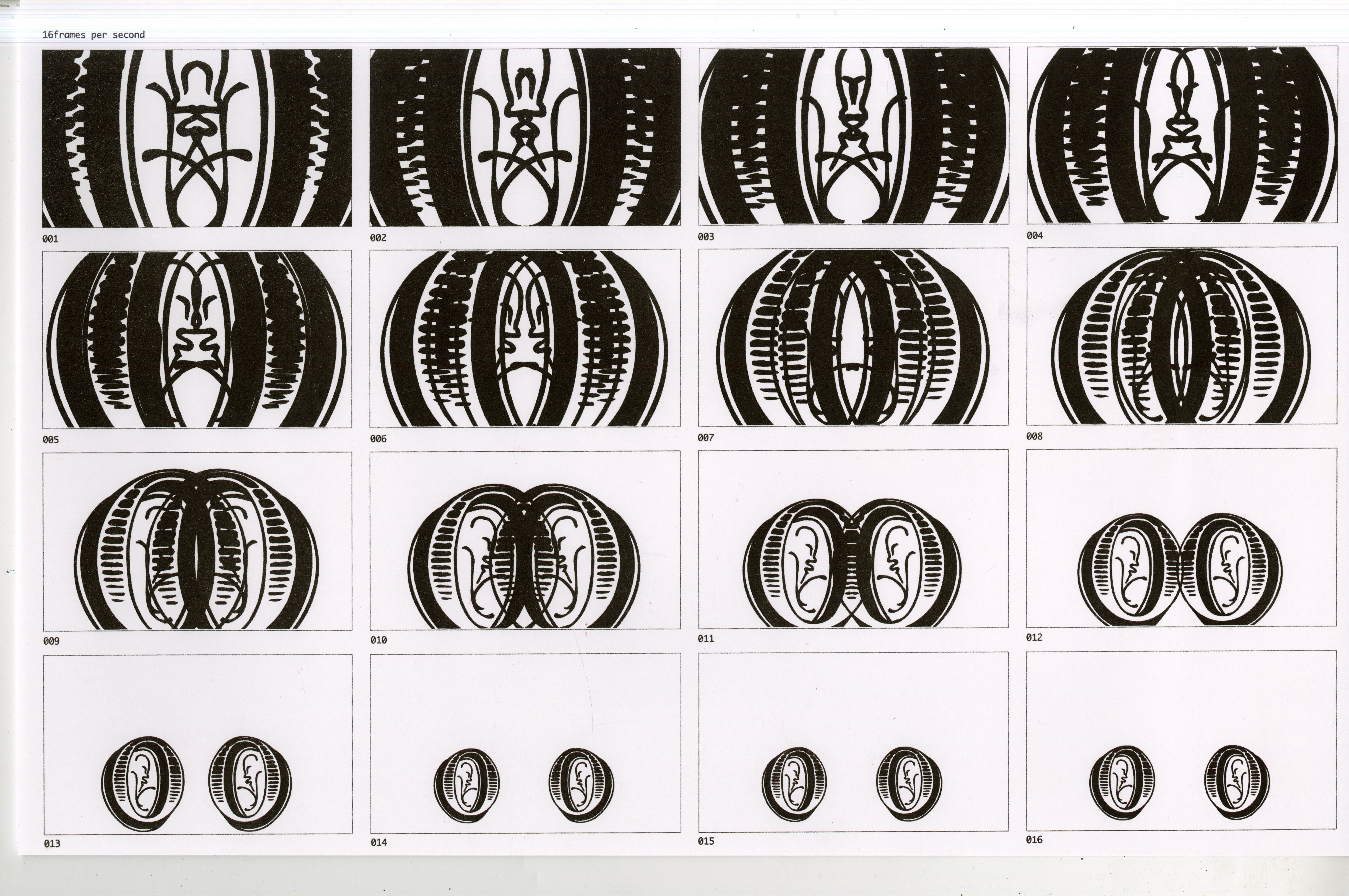
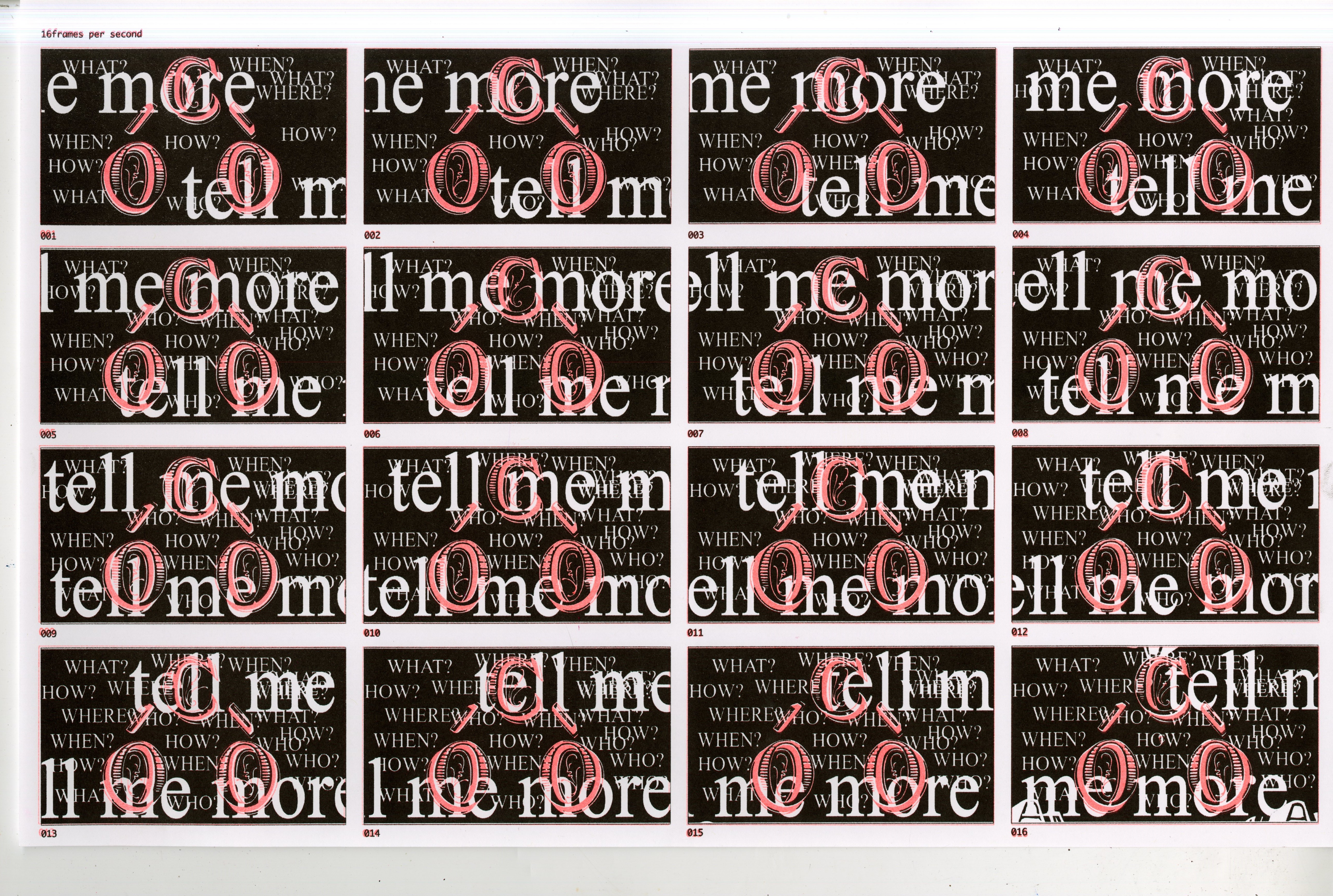
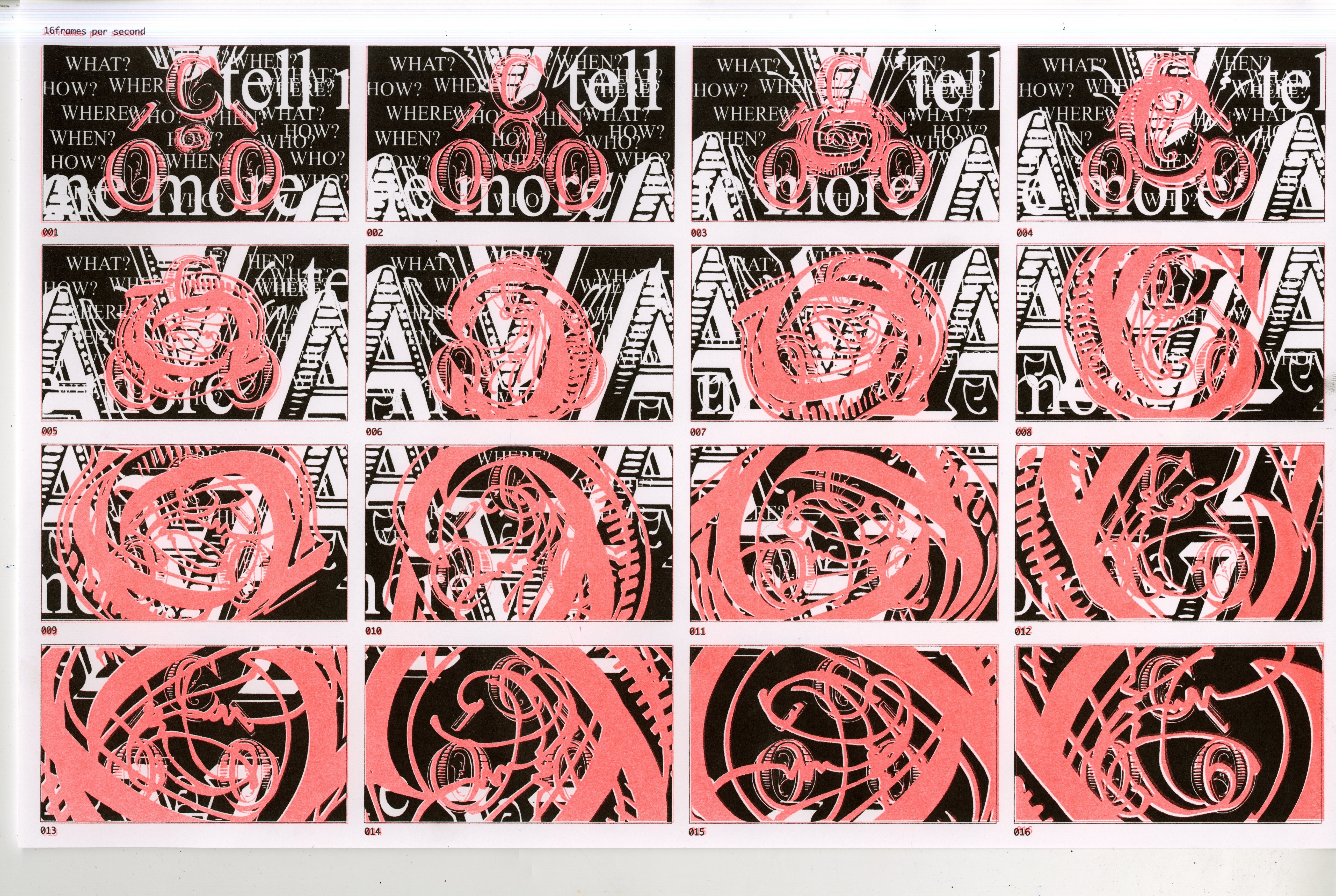
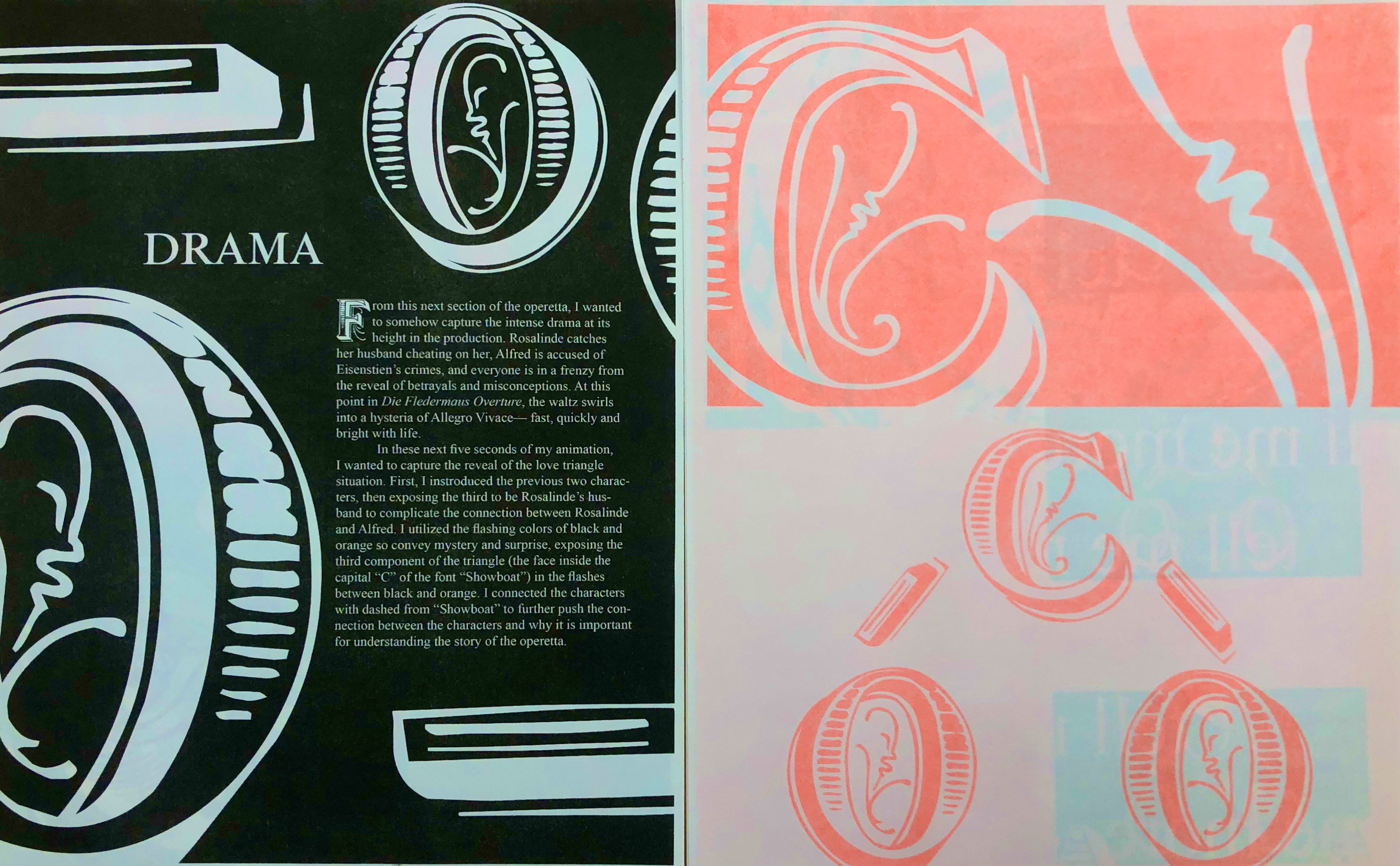
From this next section of the operetta, I wanted to somehow capture the intense drama at its height in the production. Rosalinde catches her husband cheating on her, Alfred is accused of Eisenstien’s crimes, and everyone is in a frenzy from the reveal of betrayals and misconceptions. At this point in Die Fledermaus Overture, the waltz swirls into a hysteria of Allegro Vivace — fast, quickly and bright with life.
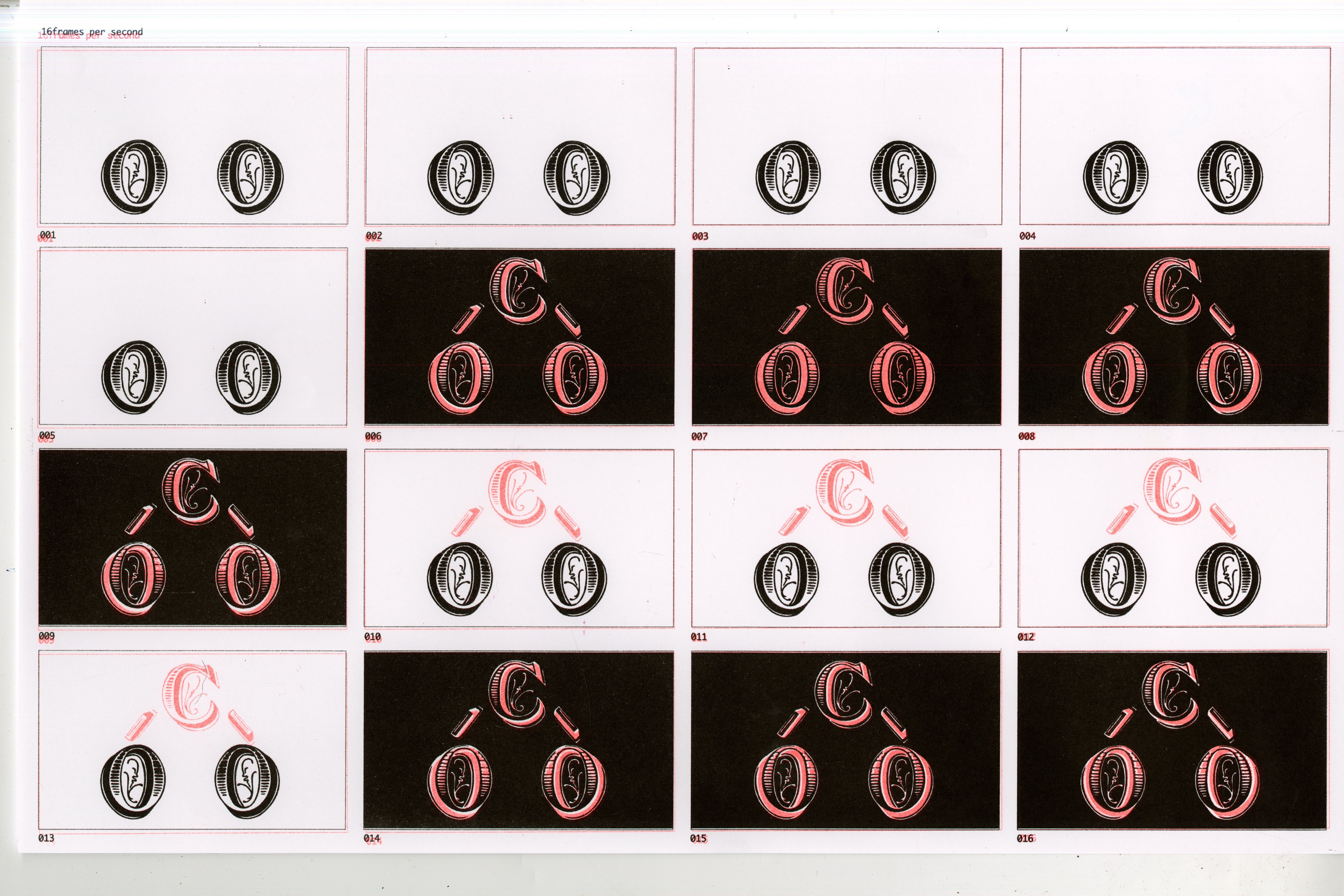
In these next five seconds of my animation, I wanted to capture the reveal of the love triangle situation. First, I introduced the previous two characters, then exposed the third to be Rosalinde’s husband to complicate the connection between Rosalinde and Alfred. I utilized the flashing colors of black and orange to convey mystery and surprise, exposing the third component of the triangle (the face inside the capital “C” of the font “Showboat”) in the flashes between black and orange. I connected the characters with dashed from “Showboat” to further push the connection between the characters and why it is important for understanding the story of the operetta.
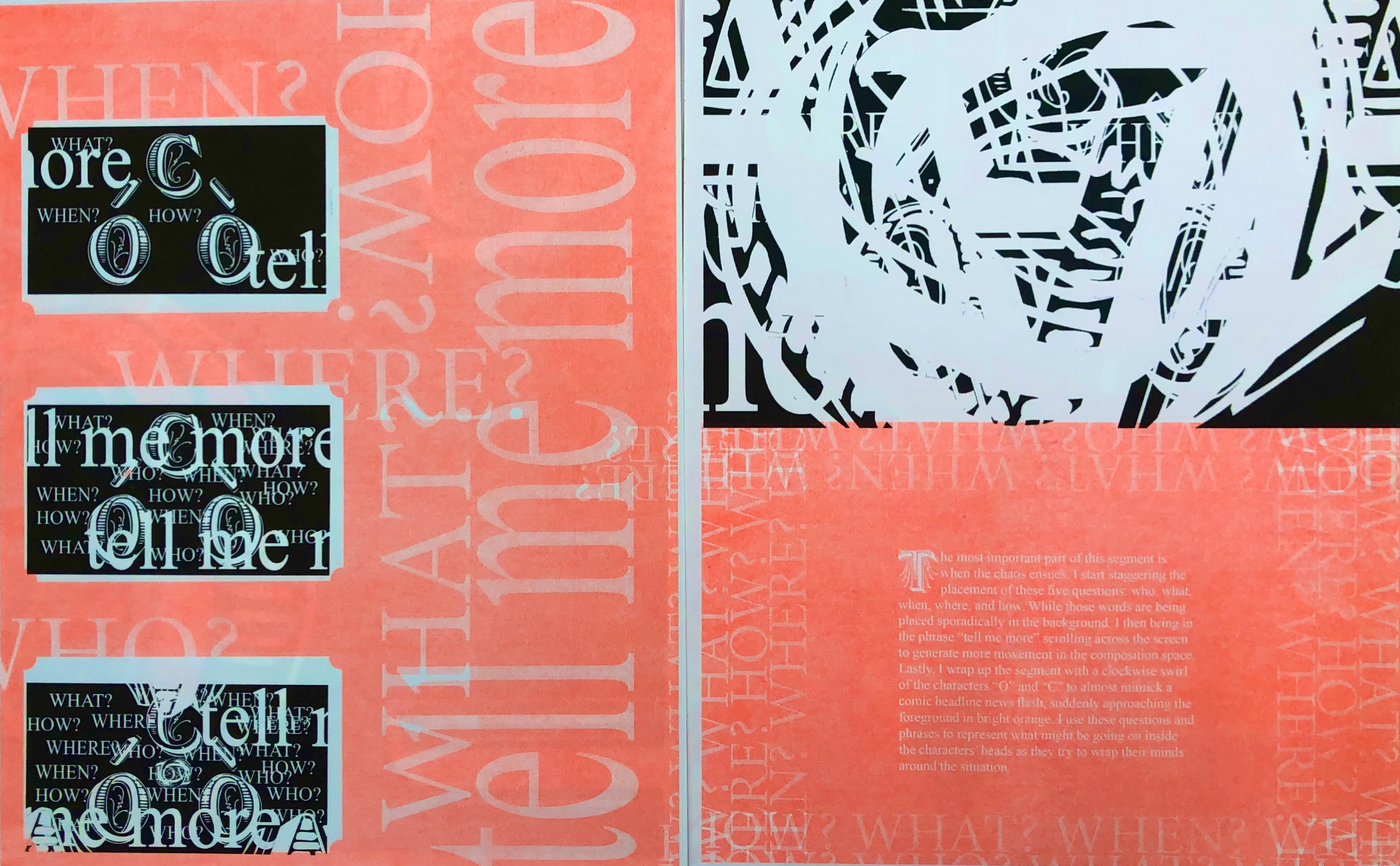
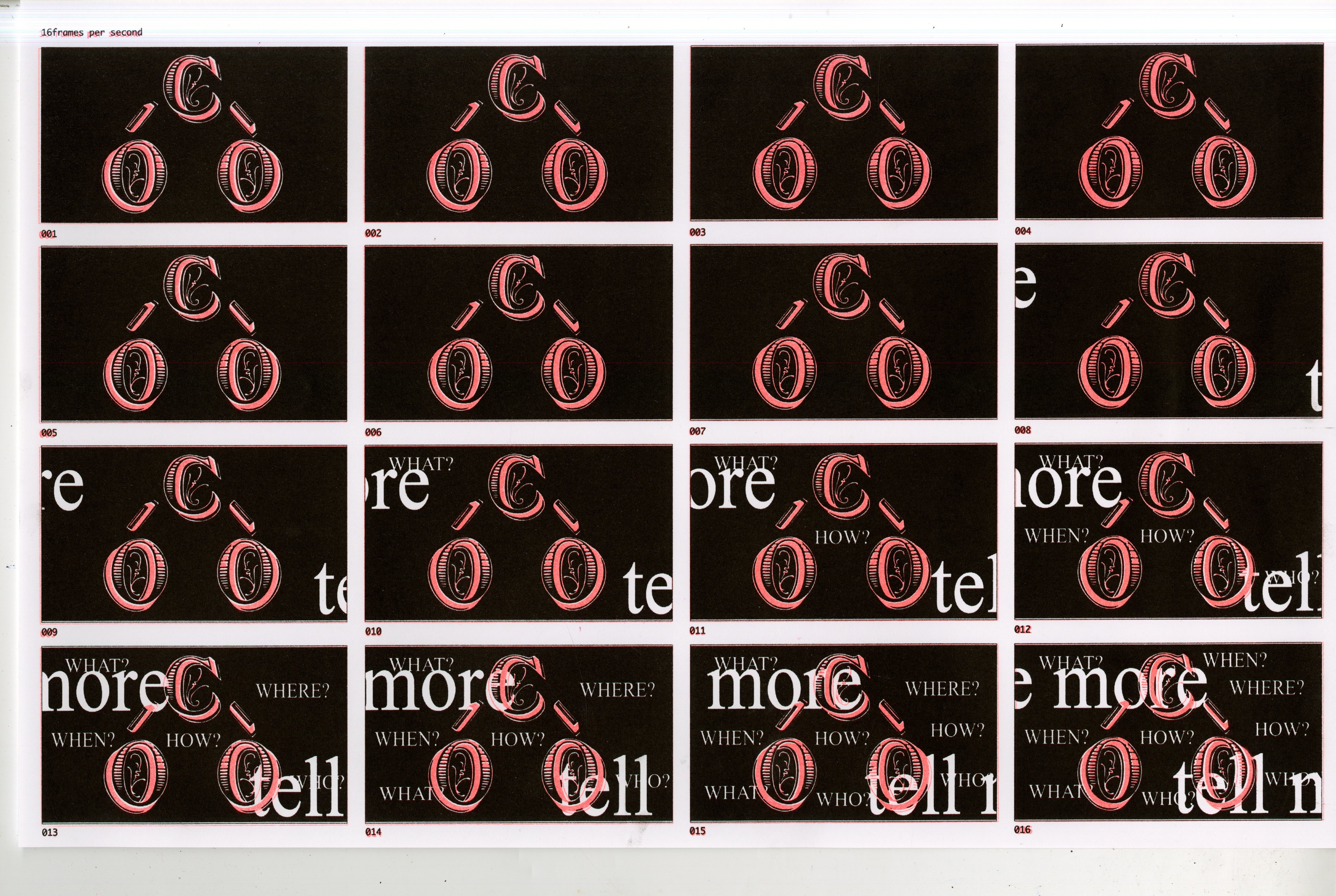
The most important part of this segment is when the chaos ensues. I start staggering the placement of these five questions: who, what, when, where, and how. While those words are being placed sporadically in the background, I then bring in the phrase “tell me more” scrolling across the screen to generate more movement in the composition space. Lastly, I wrap up the segment with a clockwise swirl of the characters “O” and “C” to almost mimic a comic headline news flash, suddenly approaching the foreground in bright orange. I use these questions and phrases to represent what might be going on inside the characters’ heads as they try to wrap their minds around the situation.
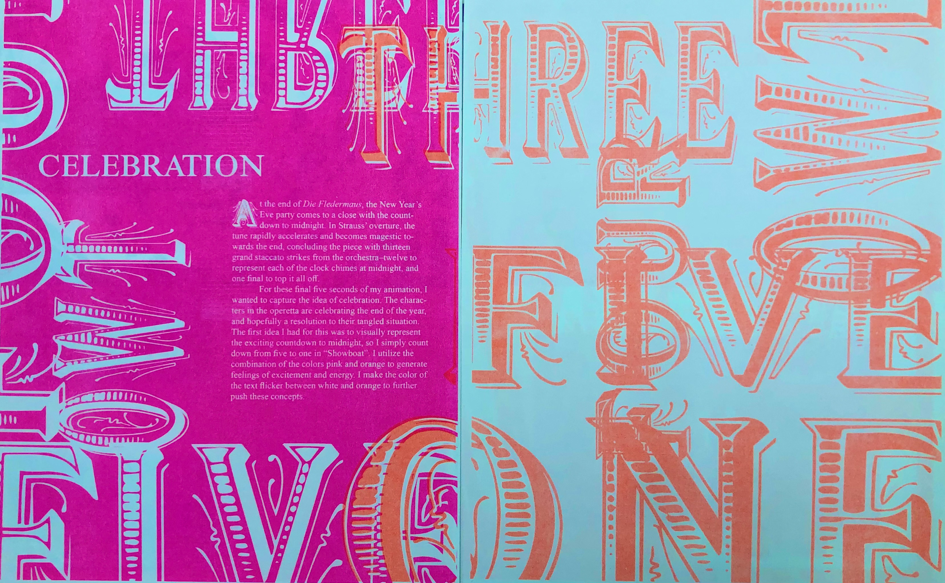
At the end of Die Fledermaus Overture, the New Year’s Eve party comes to a close with the countdown to midnight. In Strauss’ overture, the tune rapidly accelerates and becomes majestic towards the end, concluding the piece with thirteen grand staccato strikes from the orchestra–twelve to represent each of the clock chimes at midnight, and one final to top it all off.
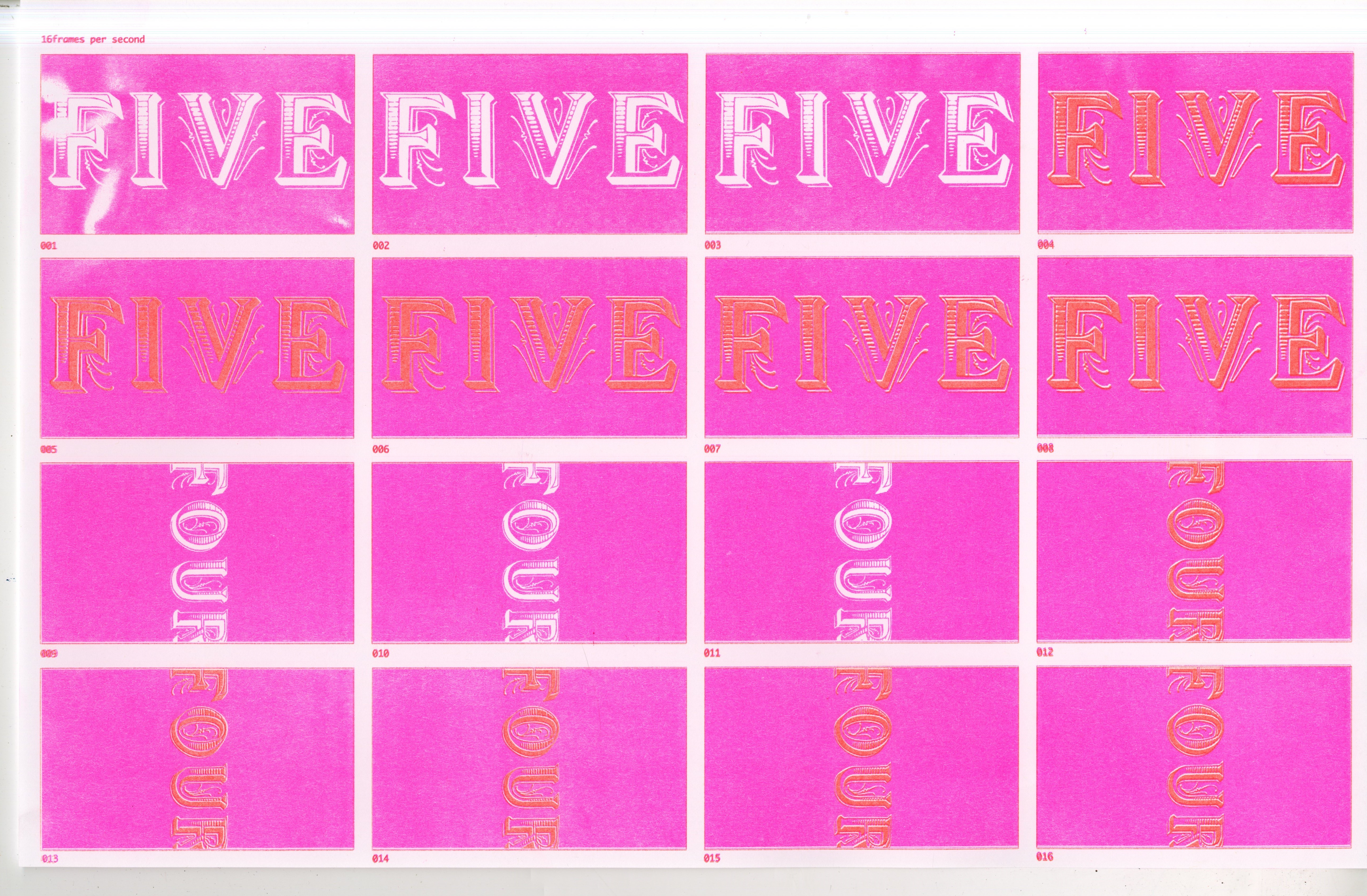
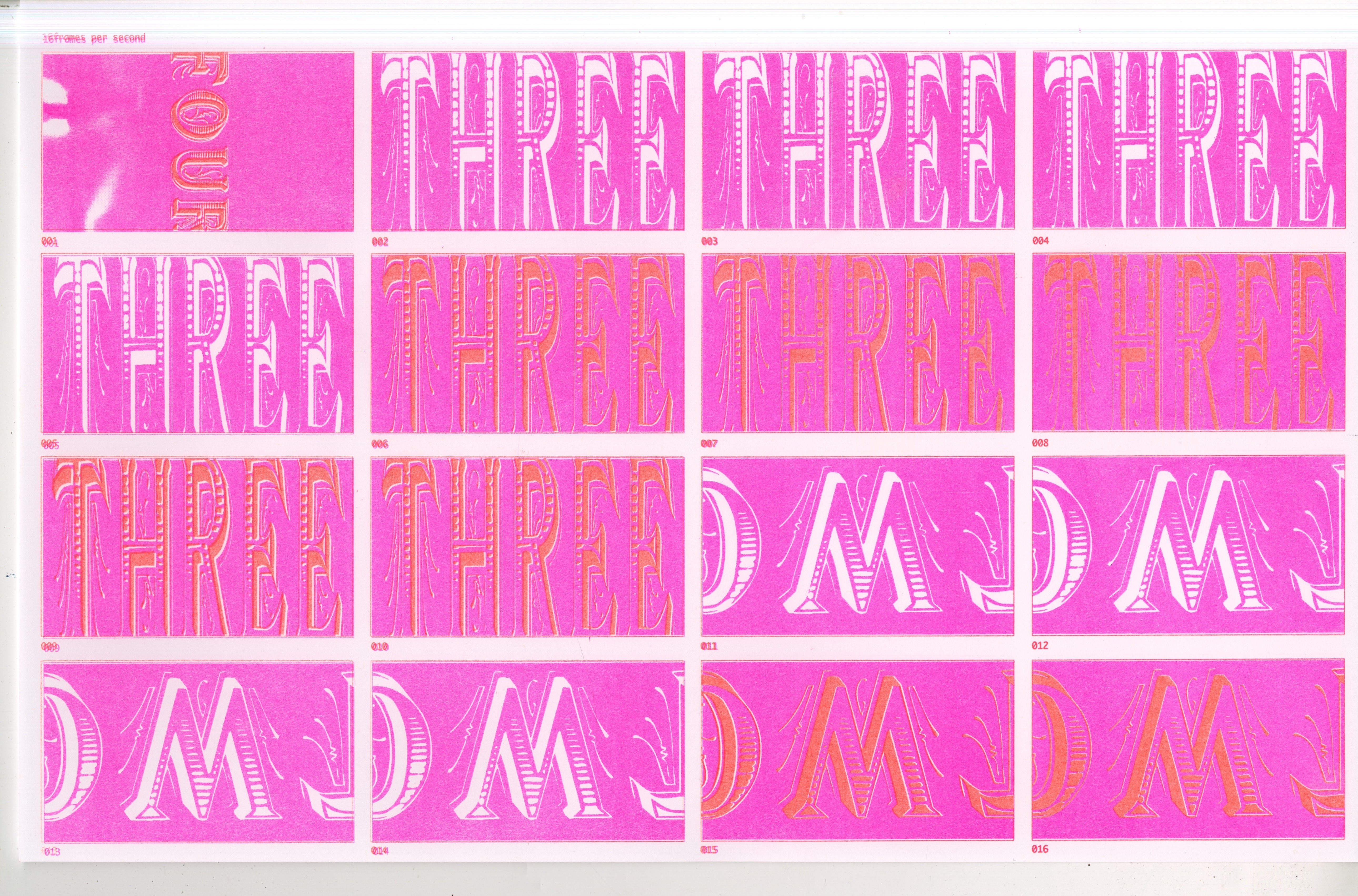
For these final five seconds of my animation, I wanted to capture the idea of celebration. The characters in the operetta are celebrating the end of the year, and hopefully a resolution to their tangled situation. The first idea I had for this was to visually represent the exciting countdown to midnight, so I simply counted down from five to one in “Showboat”. I utilize the combination of the colors pink and orange to generate feelings of excitement and energy. I make the color of the text flicker between white and orange to further push these concepts.
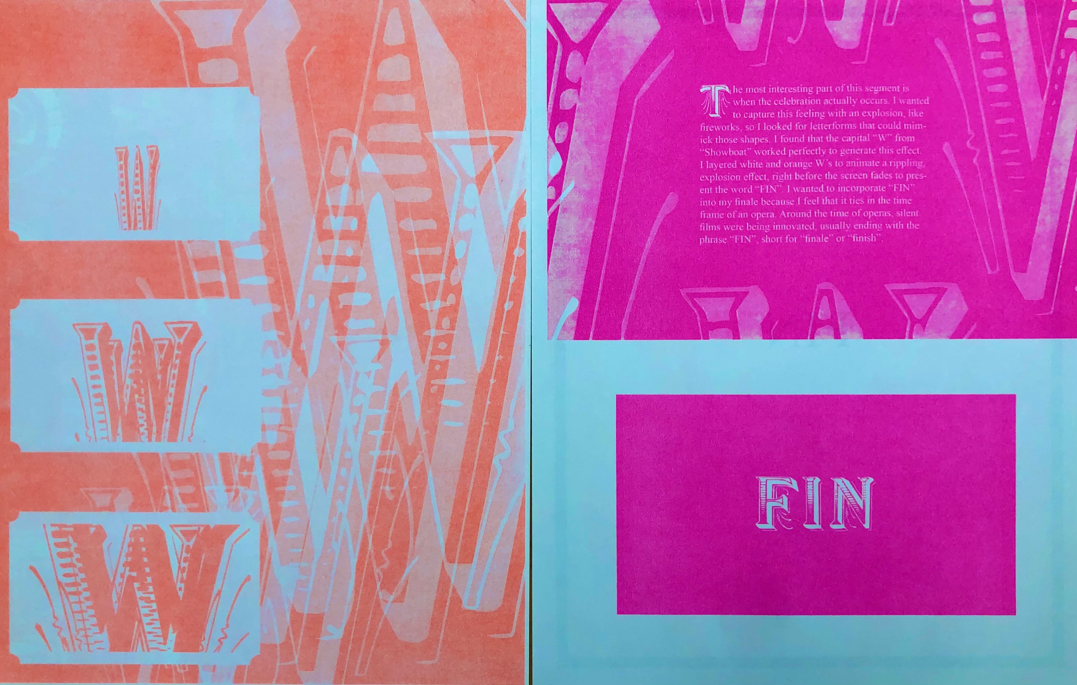
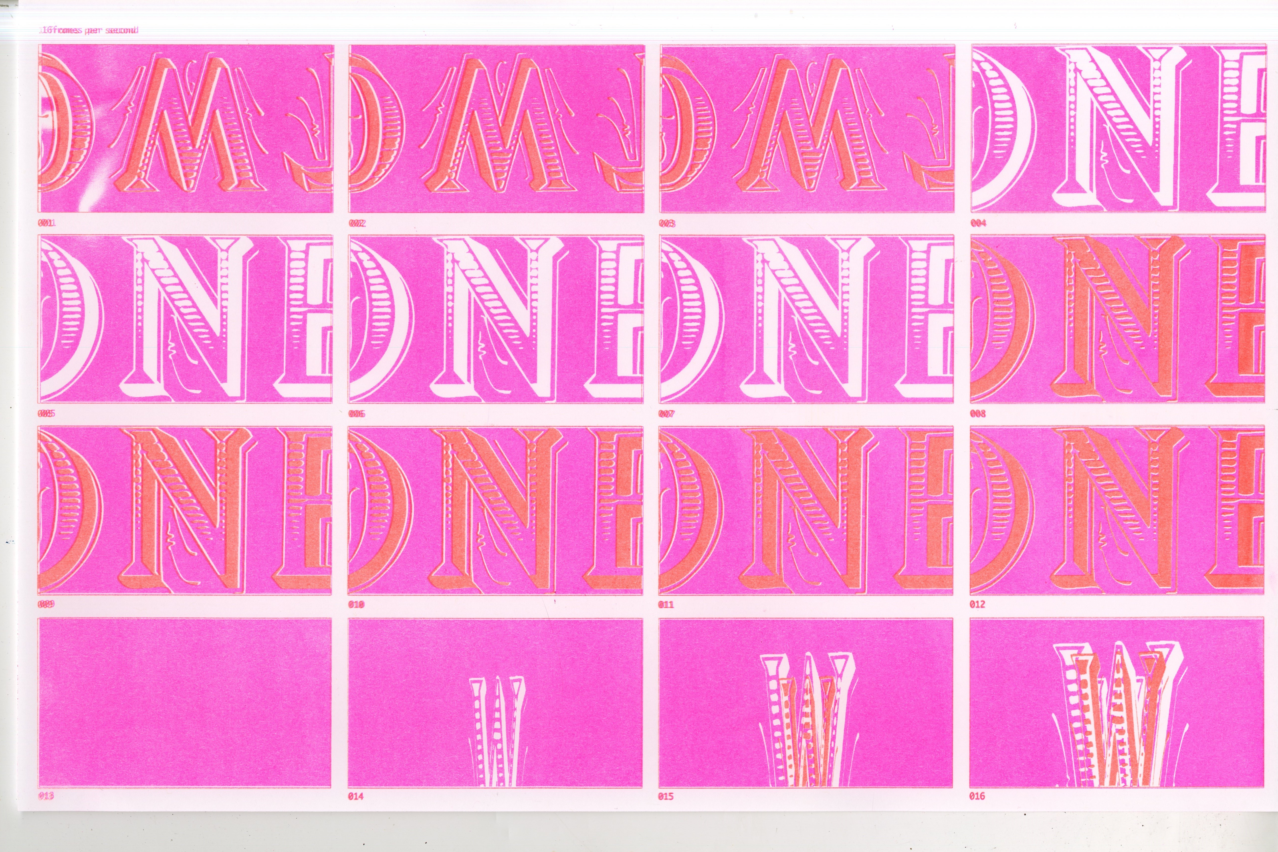
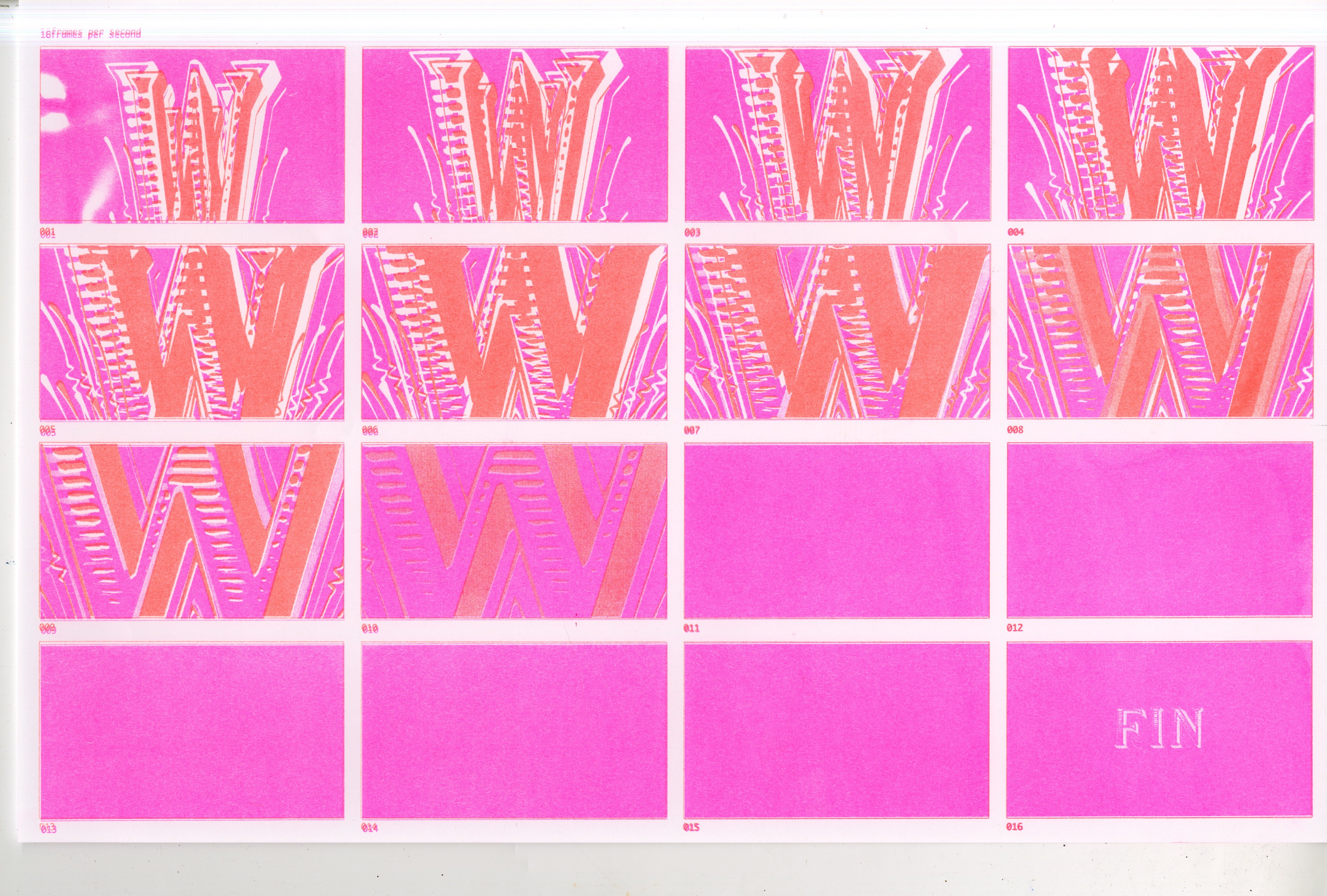
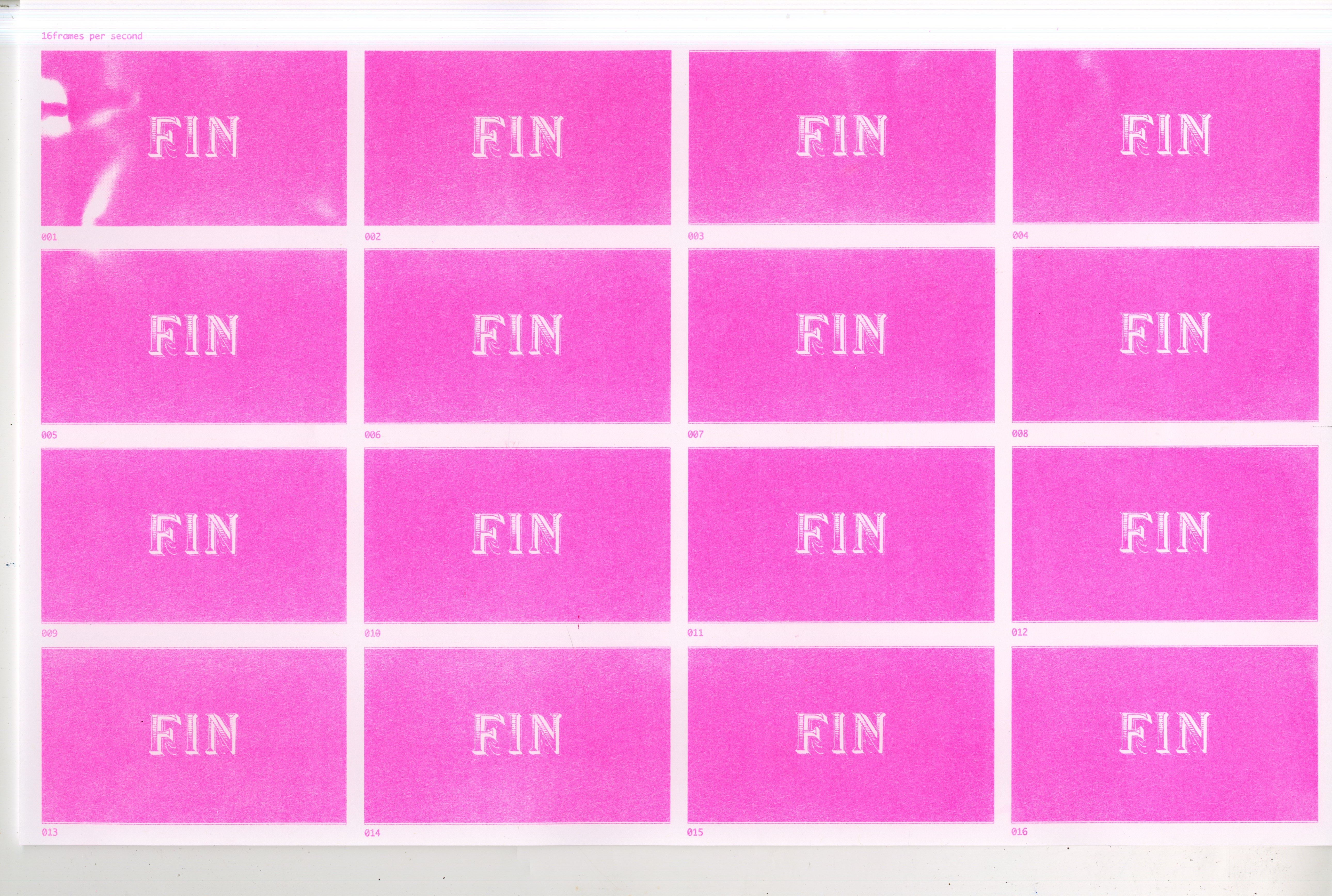
The most interesting part of this segment is when the celebration actually occurs. I wanted to capture this feeling with an explosion, like fireworks, so I looked for letterforms that could mimic those shapes. I found that the capital “W’’ from “Showboat” worked perfectly to generate this effect. I layered white and orange W’s to animate a rippling, explosion effect, right before the screen fades to present the word “FIN”. I wanted to incorporate “FIN” into my finale because I feel that it ties in the time frame of an opera. Around the time of operas, silent films were being innovated, usually ending with the phrase “FIN”, short for “finale” or “finish”.
As for takeaways from this project, I have learned just about everything there is to know about the Riso machine. That beast is a menace. Be careful with the type of paper you use, the density of ink in your masters. All should be smooth sailing as long as the printer doesn’t decide to eat your paper without explanation. One of the non-Riso-related challenges I had with this project was learning about the ins-and-outs of animations. One of the most interesting challenges was aligning the frames as best as I could to make the animation run without shaking. I suppose these quirks in the design are what generate the character of the medium used for this project.
Below are shots of my Riso-printed pages of animation frames: