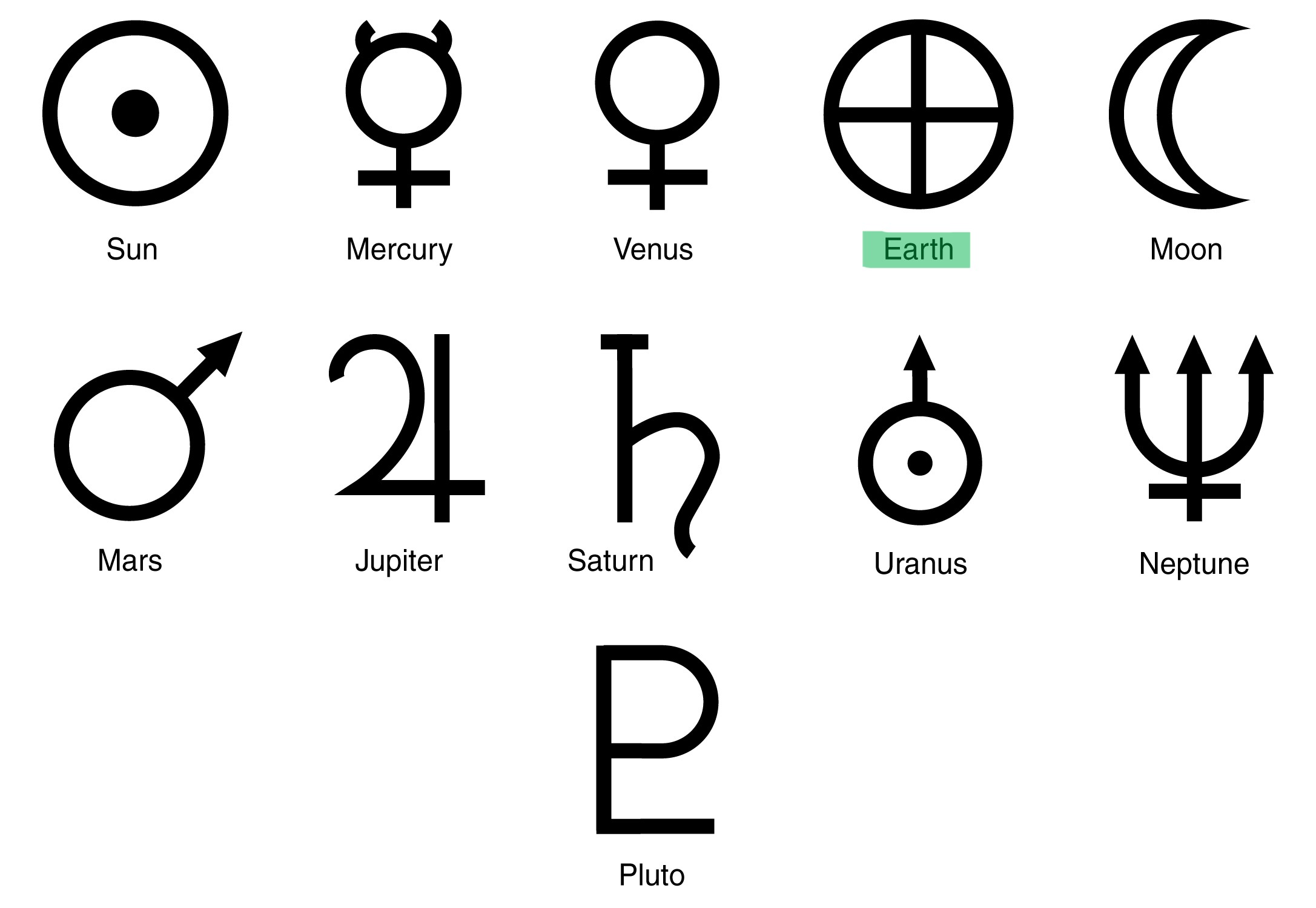
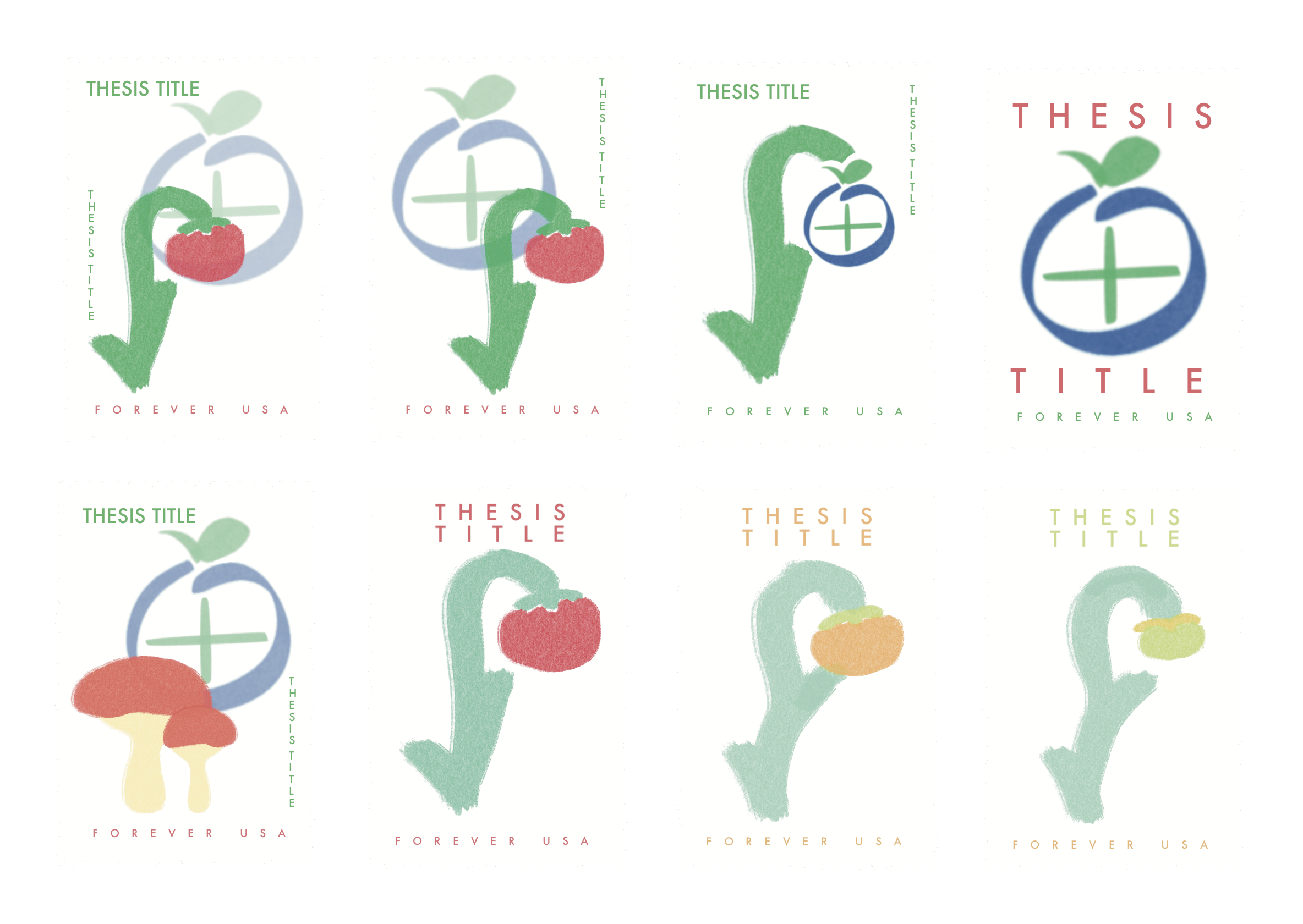
For the app's logo design, I was looking to make a symbol that wasn't too cliche amongst all of the “go green” symbols that already exist for sustainability. I took inspiration from the Solar System Symbols, specifically the symbol for Earth. I went from there to make it look like the Earth symbol was a fruit or berry, echoing the garden metaphor of my thesis.
I then settled on this final version, which also solidified what colors I wanted to include in my color palette for the entire project.
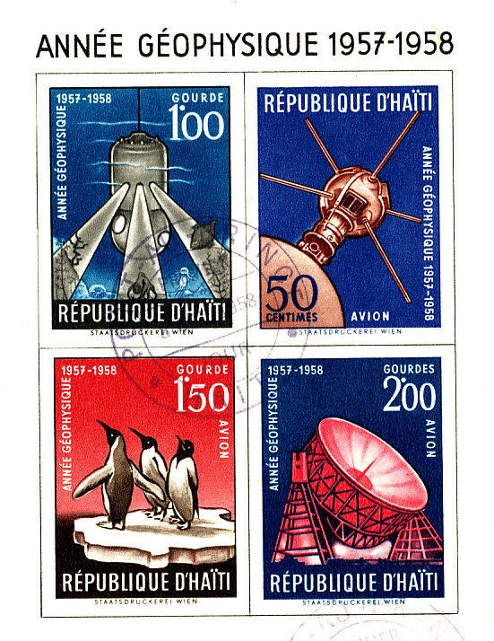
For the collectible artifacts, I wanted to make something outside of the app that could potentially help make the project feel like a movement, or at least help me explore opportunities for design outside of the technology that would be the app.
I started looking at stamps made from the International Geophysical Year (IGY) project from the late 1950s. During the Cold War, scientists and researchers from all over the world agreed to conduct a global study of Earth's geophysics, and they discovered a ton of new information about the planet. I was inspired by the idea of having an artifact to commemorate an experience or movement like that, so I tried making artifacts of my own. I figured incorporating the logo into a collectible item could promote the identity of my app.